Category: 3D Printing

Well 3D printing of course

Adventures in Multi-Color 3D Printing

with just one extruder!

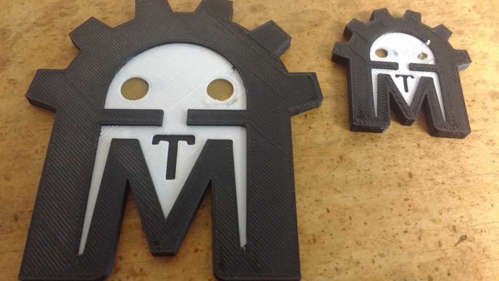
A couple weeks ago, Rachel asked me for a 3D printed AMT Robot similar to this one:

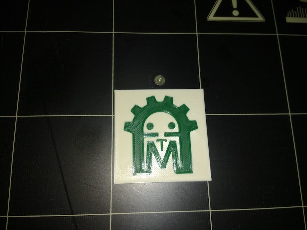
She wanted it to be done in our official logo colors, and was okay with a thinner version. This was a perfect opportunity to make good on my year-old promise to document my multi-color printing trick on the Prusa MK2.

Prusa-research offers a free utility which allows you to insert a filament-change-pause command at any layer in the print job. The new color will be used for the entire layer, until the next color change is encountered.


http://www.prusaprinters.org/color-print/

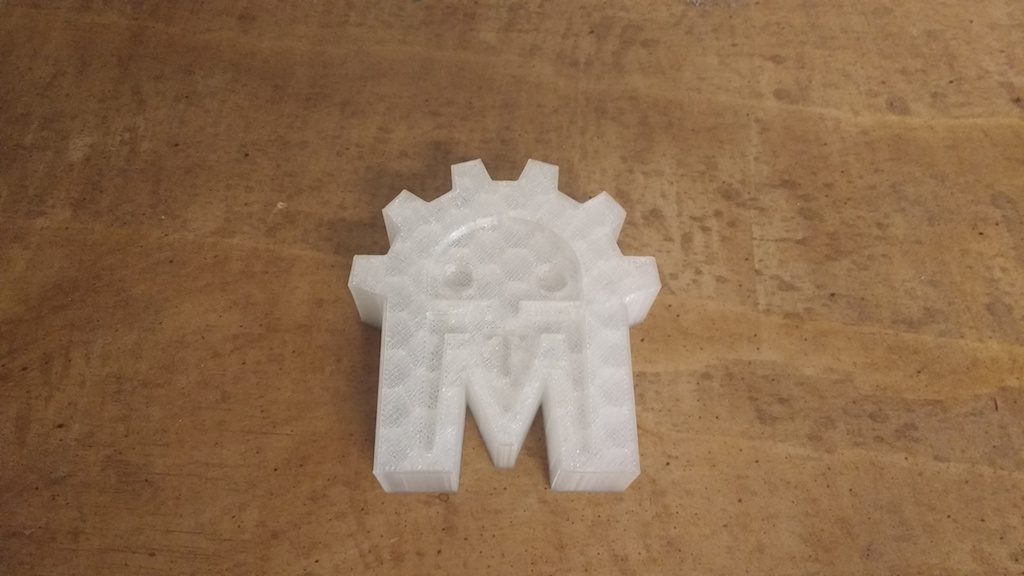
This can be useful for certain effects, like this little AMT robot plaque I made last year.

But true multi-color printing can be done the same way, if you have the patience to change filament manually at every color change. This eliminates the more complex multi-color models, but with a little planning, the filament changes can be kept to a minimum and yield surprisingly nice effects!

The basic steps are:

  • Prepare your model
  • Configure the slicer for multiple-extruders
  • Load the STLs and slice
  • manually edit the gcode, replacing extruder changes with filament-change-pause commands
  • print as usual; change filament when prompted

These instructions assume Slic3r and our Prusa i3 MK2. Your printer must support a working filament change pause command. Unfortunately, this command is not universally implemented. If you’re unsure, you might want to try a small-scale experiment or two.

Prepare the model

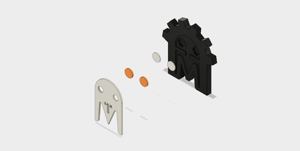
I made a new model in Fusion 360. There are three colors: Black, white, and orange. I modeled the different colored sections as separate bodies like so:

Note that there’s a white section just behind the orange eyes. That’s because the orange I have available is a translucent color which did not show well when printed over the black main color.

By changing visibility and exporting the model three times, I ended up with one STL for each color, even though the white and orange sections have multiple bodies.

Configure the slicer

Note: Please don’t save these configuration changes on our 3D print computer. Make temporary changes only, or use your own laptop.

Under printer settings/general, set extruders to 3 (for three colors). The additional extruders will be copies of the first, which is what we want.

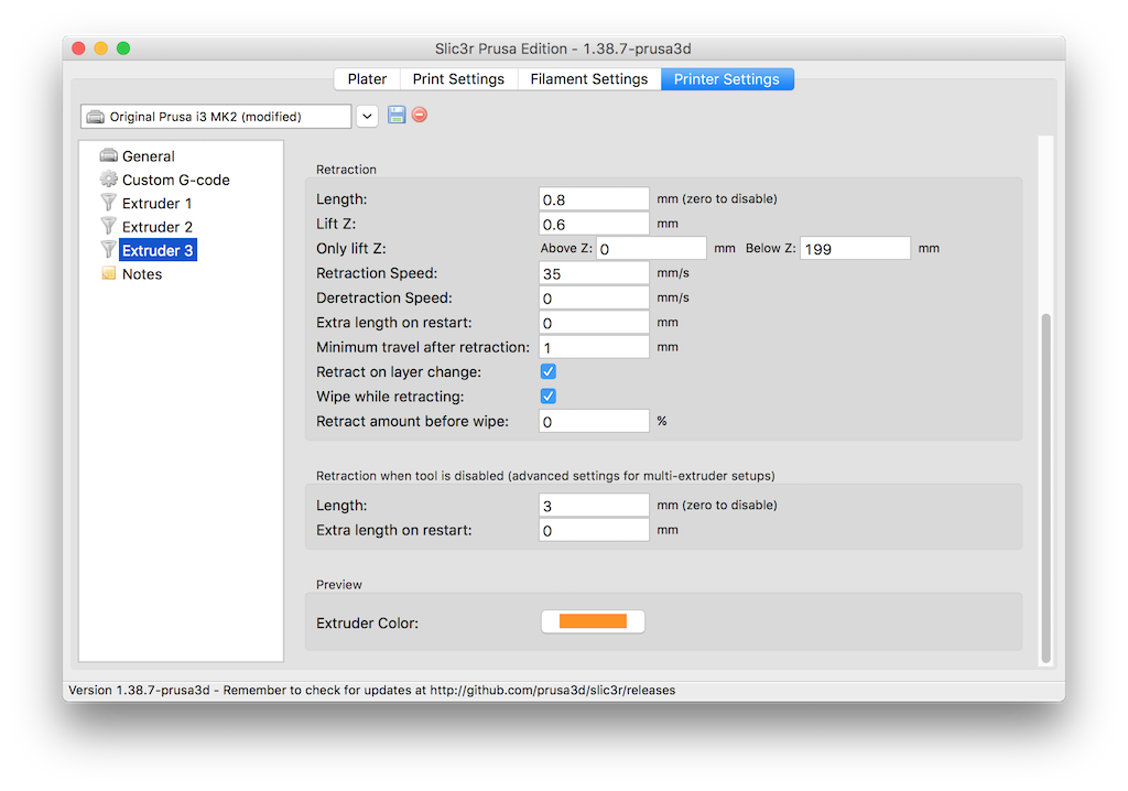
Choose extruder 1 and scroll to the bottom of the panel on the right. Click the ‘extruder color’ settings and choose black. Set Extruder 2 to white and extruder 3 to orange.

Slice the model

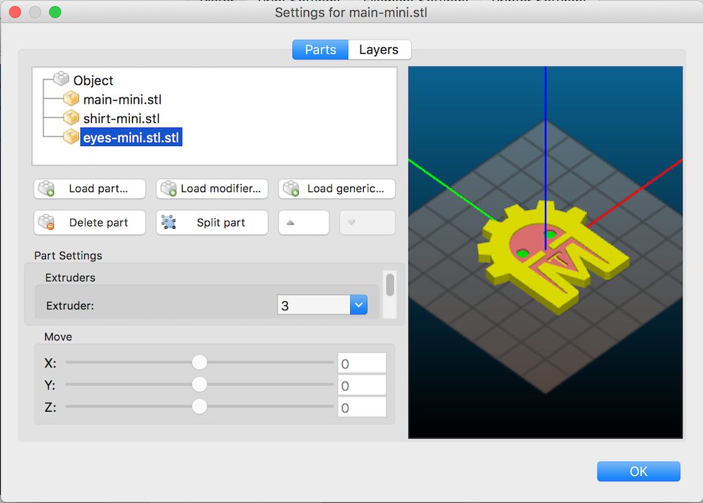
Click ‘add’ and load the main (black) STL file. Then click ‘Settings’ and use the ‘load part’ command to load the white and orange STL files.

Select each part in turn and choose the appropriate extruder: For the main black part, use extruder 1; for White use extruder 2; for Orange, extruder 3.

Adjust the rest of the settings as desired. I’m using default settings for the .020mm Normal profile.

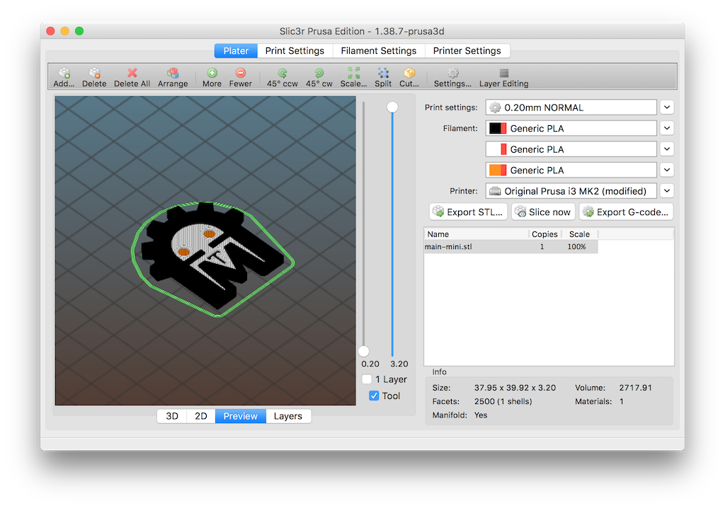
Click ‘Slice now’ if necessary, and choose ‘preview’ on the ‘plater’ tab. Check ‘tool’ to activate the tool-specific preview colors. Your preview should look like this:

Export to gcode and save to a local file.

Edit the gcode

Open the .gcode file with a text editor and find all the lines containing t0, t1, and t2. These ‘tool change’ commands correspond to extruders 1, 2, and 3 respectively. A few of them will appear in a ‘preamble’ near the beginning of the file. In the body of the file a Tx command appears for each nozzle change. The idea is to delete the ones that don’t matter, and replace the rest with M600 commands. Your slicer may give slightly different results than shown here, so a basic understanding of gcode is assumed.

In my case the first was a lone T0 command that selects the first extruder to use. I left this one intact.

.
 .
 .
 G90 ; use absolute coordinates
 M83 ; use relative distances for extrusion
 T0  ; leave this one alone!
 ;BEFORE_LAYER_CHANGE
 ;0.2
 .
 .
 .

Slightly further down, three M104 commands appeared for setting nozzle temperature. I deleted the t1 and t2 versions.

.
 .
 .
 ;AFTER_LAYER_CHANGE
 ;0.4
 M104 S210 T0 ; set temperature
 M104 S210 T1 ; set temperature ; delete these
 M104 S210 T2 ; set temperature ; two lines
 G1 X116.894 Y125.880 F7200.000
 .
 .
 .

Then the actual printing starts using the T0 (black) nozzle already selected. The next one encountered is T1.

.
 .
 .
 G1 E-0.15000 F2100.00000
 G1 Z1.400 F7200.000
 T1  ; change to M600
 G1 E-0.80000 F2100.00000
 G1 X128.346 Y108.791 F7200.000
 .
 .
 .

Change this and all remaining Tx commands to M600. While you’re at it, make a list of which extruder numbers were selected. Check them off as you go, so you know you’re loading the correct color. In my case, this list looked like this:

0 -start with black-
 1 white
 0 black
 2 orange
 0 black
 2 orange
 0 black
 1 white
 0 black
 1 white
 0 black ..for remainder of job

Print

At each M600 command, the printer will pause, prompting you to load the next color.

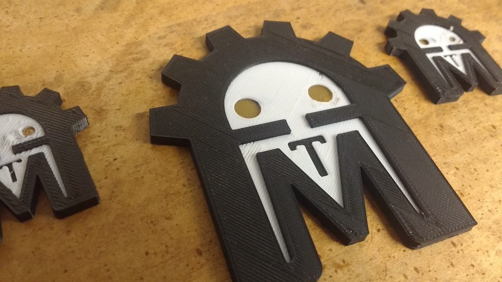
Results? Hm…

My results with the robot were a bit disappointing. Since these colors are very high contrast (black and white) the slightest little blob will noticeably mar the finish.

Also, I learned that translucent colors over a black layer need a lot of layers, or a white layer or two behind them to keep them from looking too dark. I was not satisfied with the eyes in any of these models.

One last issue is that the Prusa seems to extrude a bit of extra plastic just after resuming the print, but before the nozzle gets into position. This almost guarantees the aforementioned ‘blob’ of plastic, which invariably lands in the wrong place. With a bit of practice, I was able to quickly grab this extra blob with tweezers, but clearly there’s room for improvement! Maybe there’s a setting I missed somewhere.

Still, I think it’s a worthwhile technique to know, especially if combined with other effects.

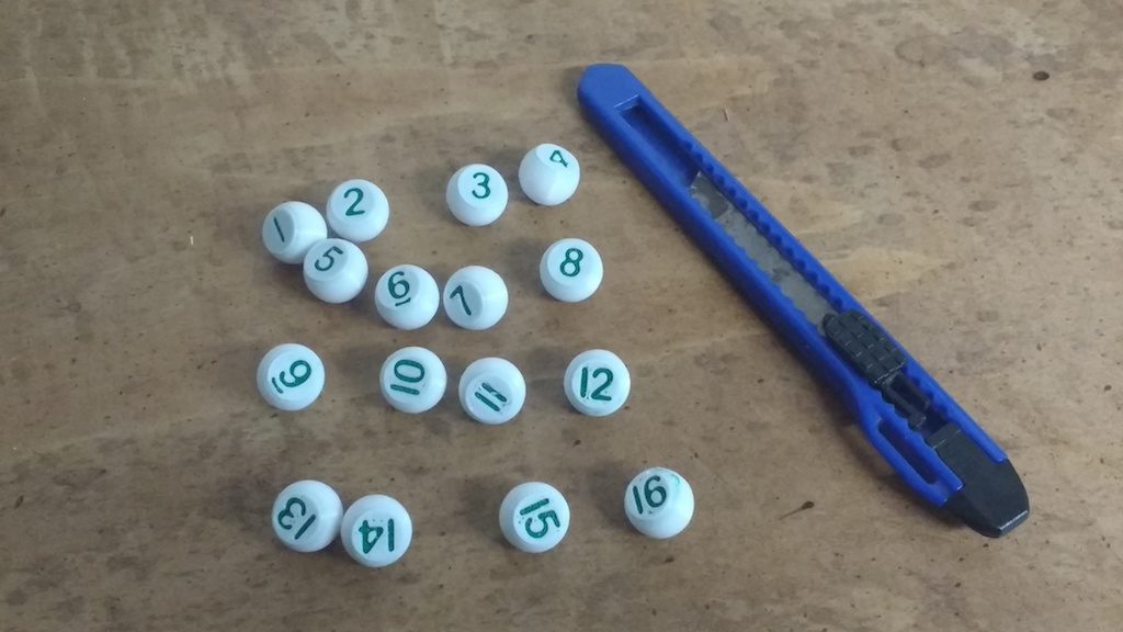
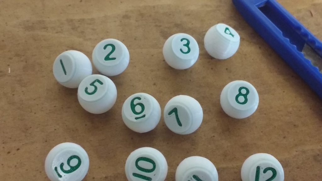
I’m an avid pool player and have recently taken an interest in games that require each player to randomly choose a ‘game ball.’ The traditional way to do this is via a set of ‘peas’ and a shaker bottle.

My peas are spheres with a flat spot on on side; the flat part faces down when printing. The numbers are recessed into this surface. These might work fine as-is, or a bit of paint could carefully be applied in the recess. I decided to try embedding a disc of contrasting color just behind the recess. I printed in white with green highlight, and got good results by turning the speed down to just 40% for the first few layers. Those finely detailed numbers are tricky! (I’ll save the bottle for another post!)

Best Practices for parametric design in Fusion 360

On Monday, Chelsea came to me with a question about Fusion 360’s loft tool. I was unable to give a quick answer, so later I practiced a bit by making an approximate copy of the design she was working on. As I was looking it over, I found that it also illustrated a few ‘best practices’ I’ve cultivated that I think make my designs easier to edit and maintain. Chelsea has given me permission to share them with you here.

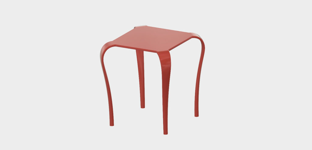
The project is an end table with legs that gracefully descend from a simple square top. The legs emerge from the corners of the table, bend downward, and transition to a circular section at the feet. Imagine four angry Cobras swallowing the corners of the tabletop!

The legs look like a job for Fusion 360’s Loft tool. Since this loft must follow a curved path, we’ll need either centerline or guide rails, and a bit of planning to make it come out right.

Here are the steps I took. You may follow along and recreate it, or merely inspect my design linked below. This is not a tutorial for complete newcomers: I gloss over the keystrokes and mundane details. I think it will be worthwhile reading anyway. The sooner you adopt habits like these, the faster you’ll become productive with Fusion.

First sketch the tabletop on the horizontal plane which is X/Y in my configuration. Note that I’ve deliberately put the sketch origin in the middle of the tabletop. Since this tabletop is symmetrical about its center, this may come in handy later.

Note also that I’ve managed to fully constrain the sketch using just two dimensions (and a lot of other constraints). I’ve chosen dimensions that define the features that I may want to alter later: the overall width of the tabletop and the width of the corner faces.

Keep your sketches tidy!

When helping folks out with Fusion, I see a lot of messy sketches. I think the best sketches have no more detail than needed to support their associated operation, are fully constrained, and clearly express the design intent.

Above all, do get in the habit of fully constraining your sketch every time you edit. You should not be able to drag a line or curve out of place.

This is especially important in Fusion 360, since it’s possible to jog sketch elements around without first opening the sketch for edit. When selecting an unconstrained profile to be extruded or revolved, it’s way too easy to bump something out of its intended location. I think this is a terrible feature of Fusion, but if it disciplines you to constrain your sketches, perhaps it’s ultimately a good thing!

Here are a few other things I try to avoid:

Duplicated dimensions
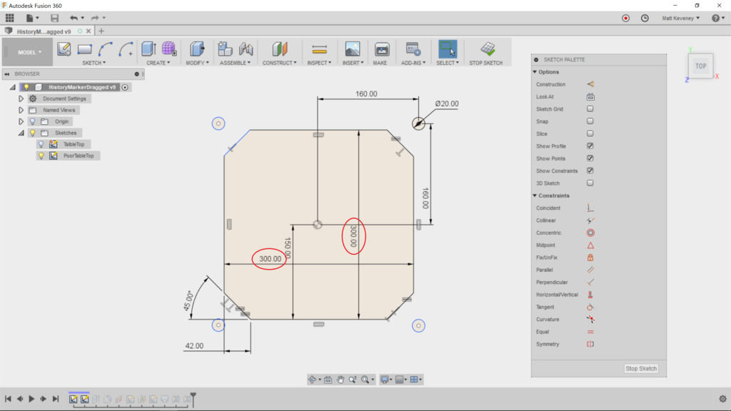
If two features are the same length, use the equal constraint instead, or at least reference one master dimension from the duplicate. This way, you’ll be able to change the dimension in one place.

Dimensions on the wrong things
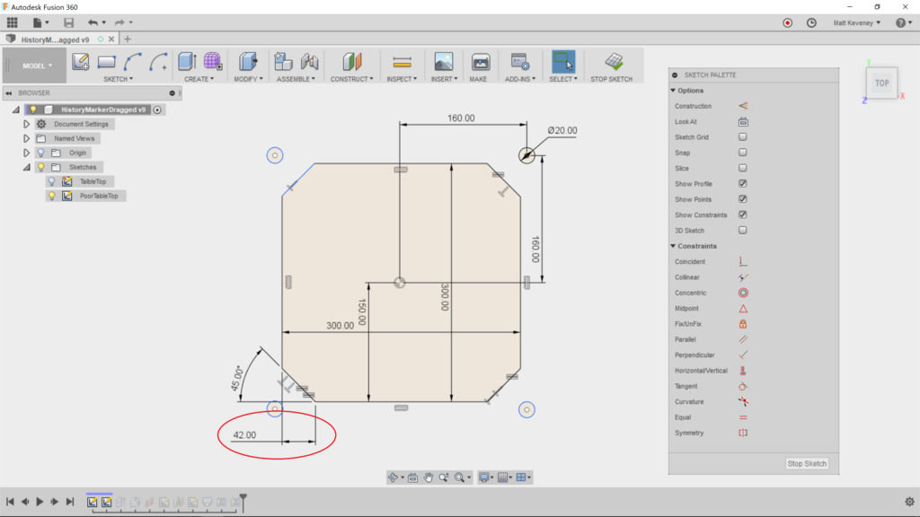
The corner edge could be constrained by defining a distance from the cutoff corner, but this does not seem like the most natural choice. If I were describing this table to a friend or client, I would rather say “the legs are 60mm wide at the top” than “the legs descend from edges that were cut 42mm from the corners.” This is my guiding principle when choosing which features to dimension: Would I describe it to someone else in the same terms?

A dimension where a constraint is more appropriate
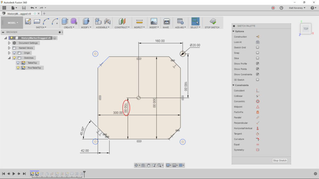
Here the top has been centered by specifying dimensions one half the width of the tabletop. Using a pair of construction lines constrained to the midpoints clarifies the intent, and eliminates a step if we ever want to resize the table.

Unconstrained geometry
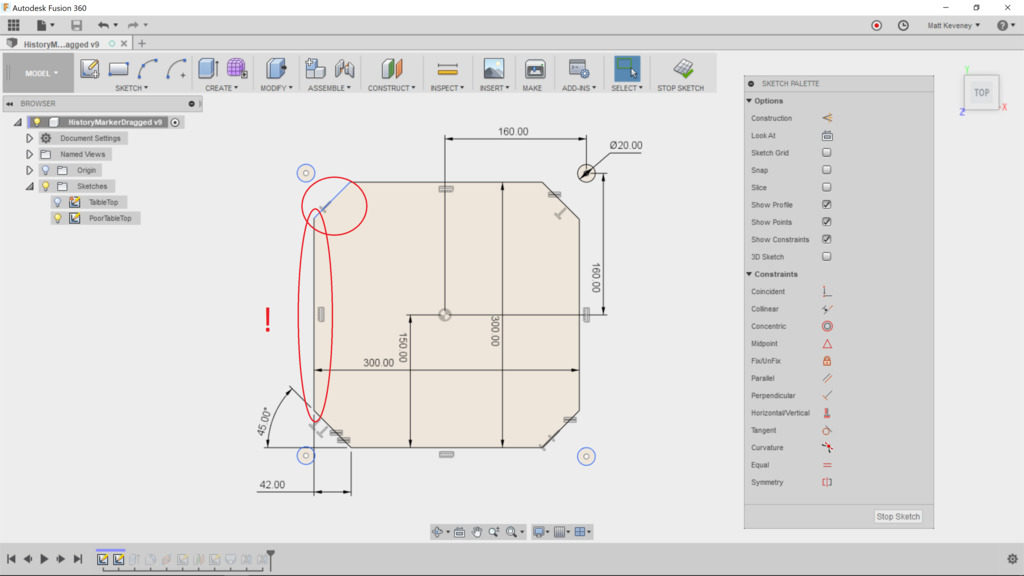
A few of the edges appear to be correct, but have not been defined. It may look okay on screen, but if you render this design with a CNC machine or 3D printer, the part dimensions will be incorrect.

If you’re transitioning from an older CAD or illustration program that relies on a ‘snap grid’ to align points, break that habit now! The grid may be convenient for drawing something in approximately the right size, but it does not constrain your sketch geometry. I recommend you turn the grid off and never look back.

Note: Fusion tries to display unconstrained geometry in blue, and constrained geometry in black. Unfortunately this feature is riddled with bugs! I’ve seen countless cases where partially constrained geometry is displayed in black, like the left vertical edge of this sketch. Beware!

Superfluous geometry

The profiles of the feet have been defined in this sketch as well, even though those profiles will not be used when extruding the tabletop. I see this a lot. The designer may be thinking in terms of old-fashioned blueprints, which were intended to communicate a design. A top-view drawing of this table would generally illustrate the position of the feet, and would probably show the shape of the legs from that perspective too.

Sketches in Fusion are for defining the design, not for communicating it. Each of these features should be defined in a separate sketch. If you need a drawing, create it with the ‘drawing’ feature after the model is complete.

Just before closing any sketch, always try modifying a dimension or two, just to make sure the sketch resizes as you expect:
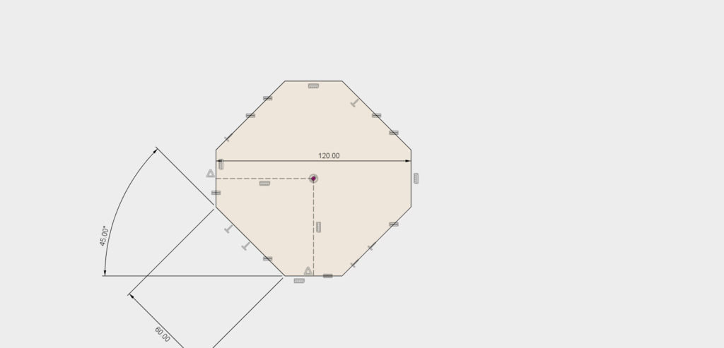
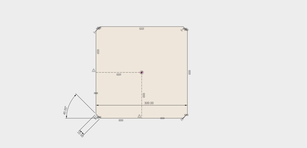
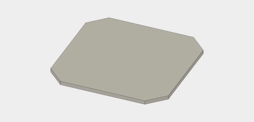
Now back to the model. Save the sketch and extrude the tabletop. I’ve chosen a thickness of 10mm.
Now we need to create a construction plane on which we’ll sketch a loft center-line. We have a lot of choices here: we could use the ‘Midplane’ tool, choosing two opposite corner faces, or we could use the ‘Plane at Angle’ tool, using the central vertical axis and an angle of 45 degrees.

In this case, I prefer the ‘Plane Along Path’ tool, selecting the upper edge of one corner as the path. The distance must be set to 0.5 to position the plane in the middle of this edge. Since it’s defined relative to this line only, the plane will remain in the correct place even if we decide to make the tabletop rectangular instead of square.
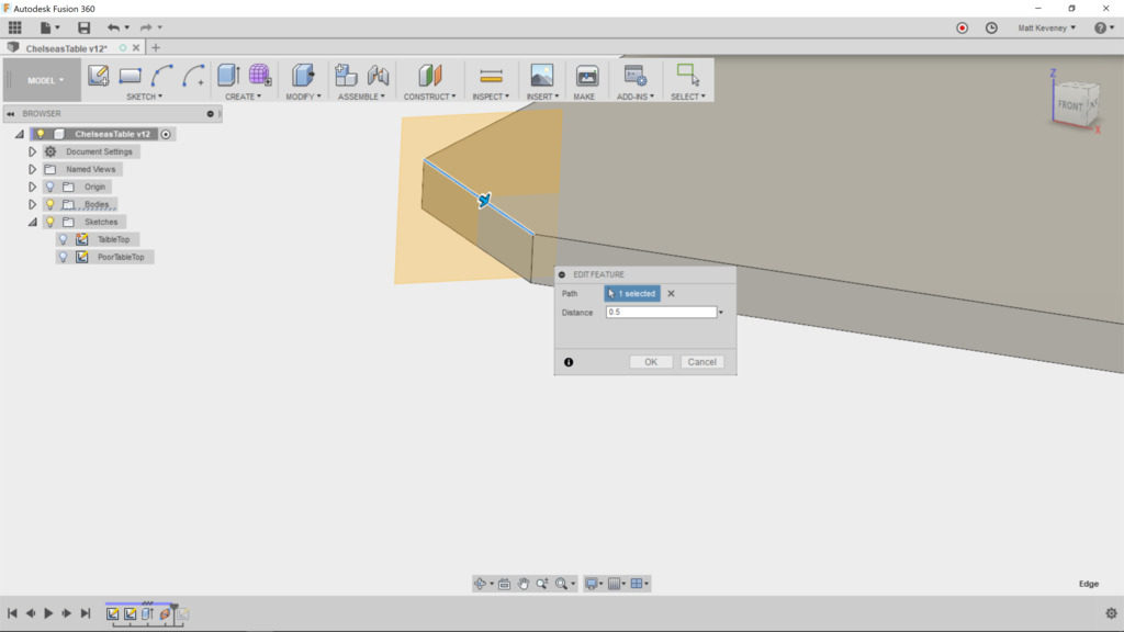
Create the sketch on this plane and project the corner edge of the table that we’ll be lofting from. This is the only projected feature we need, so I like to hide all the bodies at this point. I also hide all other sketches. This prevents inadvertent projection of other edges we don’t need to reference, and makes it clear which lines/features are actually in the sketch we’re editing.
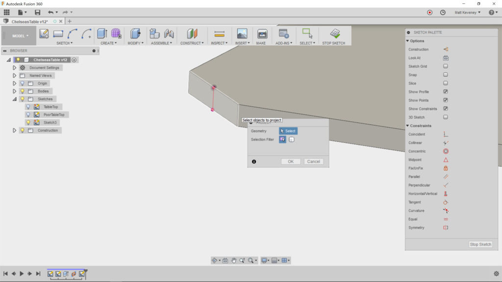
I think Fusion’s auto-projection features can do more harm than good, especially for newcomers. If you’re not careful they will add extraneous and confusing cruft to your sketches. Do your sketches contain lots of purple lines and points that seemed to spring from nowhere? Consider turning these two features OFF, at least for a while:
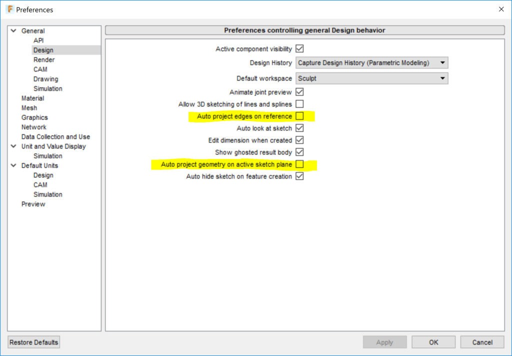
With these disabled, you’ll have to explicitly use the ‘project’ command to project an external edge into your sketch, so you’ll always know when it happens. Once you get the hang of it, you may want to turn these time-savers back on, though I’ve never liked the second one. I think it adds way too much unnecessary guff to my sketches.

Now on with the sketch. First of all, I like to convert the projected line to a construction line, since it doesn’t really participate in defining the new profile or path I’m creating; it merely serves as an anchor to keep the new geometry in the correct relative position. Create the center line as a spline through just three points.
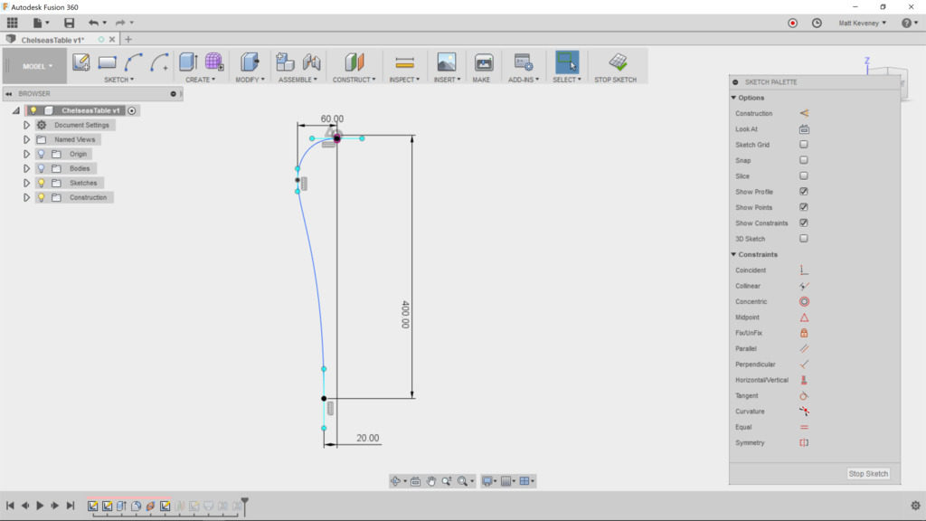
Note that I’ve constrained some aspects of the spline but not all–a rare case in which I intentionally choose not to constrain everything.

  • The position of the foot of the leg is defined in relation to the corner edge of the table.
  • The upper end of the spline is attached to the midpoint of the projected edge, since we want it to spring from the middle of that profile.
  • A horizontal/vertical constraint is applied to the upper endpoint’s ‘control handles,’ so the the end of the curve will be perpendicular to the existing face. Another at the bottom makes the leg end perpendicular to the floor.
  • The middle control point’s horizontal distance from the table edge is defined so that this distance is maintained even if we change the size of the table. By fixing this control edge vertical, we ensure that this dimension defines the outermost edge of the curve.

I like to leave the remaining aspects of the spline fluid. This shape seems to be an organic element the designer creates by eye. We could use the ‘fix’ tool to constrain the curve once we have it right–something I would generally advise. In Fusion, doing so interferes with resizing the tabletop, so I like to leave it fluid.

Note: What I really want here is some kind of ‘relative fix’ tool that locks the curve in relation to a specified sketch point, but Fusion doesn’t seem to have any such thing. Fusion’s ‘fix’ tool fixes the curve in absolute 3D space, which is admittedly easier to understand.

Now we need a sketch defining the bottom profile of the leg. Since we have no existing face there, we first create a construction plane.

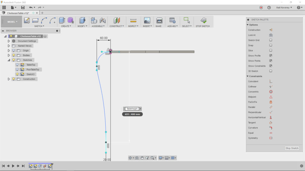
But let’s think about this a minute! This plane should always be the same distance from the tabletop as the corresponding dimension in the centerline sketch. We can achieve that by defining a parameter and using it in both places.

Create a parameter called ‘TableHeight’ and set it to 400mm.
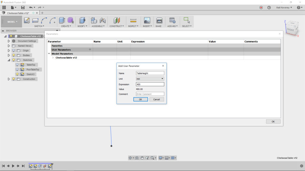
Then edit the centerline sketch and change the height dimension to ‘TableHeight.’
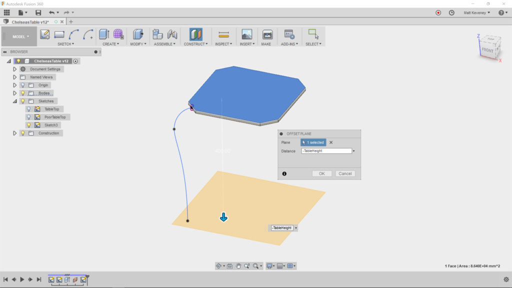
Now, finally, create the offset plane, referencing the top surface of the table, since that’s the point we measured from in the sketch. Set the offset to ‘TableHeight.’
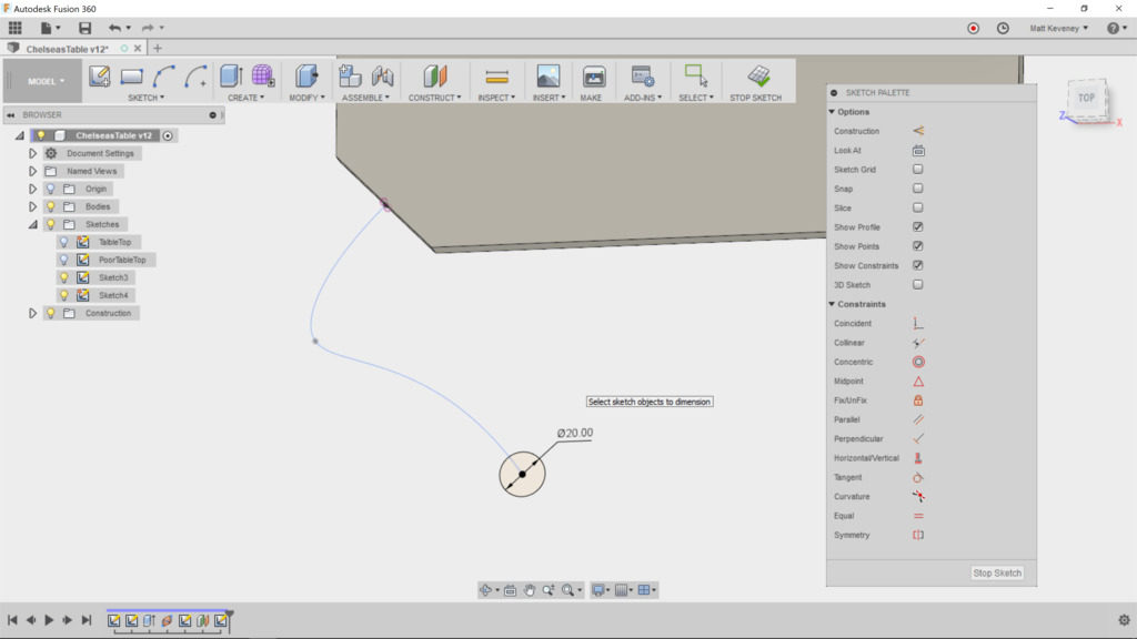
Now create a sketch on this new plane. With the centerline sketch visible, project the lower point of the centerline into our sketch. Hide the centerline sketch now, so it doesn’t distract us. I’ve chosen to just create a circle centered at the projected point and dimensioned to 20mm. Whatever shape you choose, it should be centered on this point, since the centerline is expected to pierce the center of the loft profiles.
Finish the sketch, and turn on visibility of the centerline sketch and the bodies again.
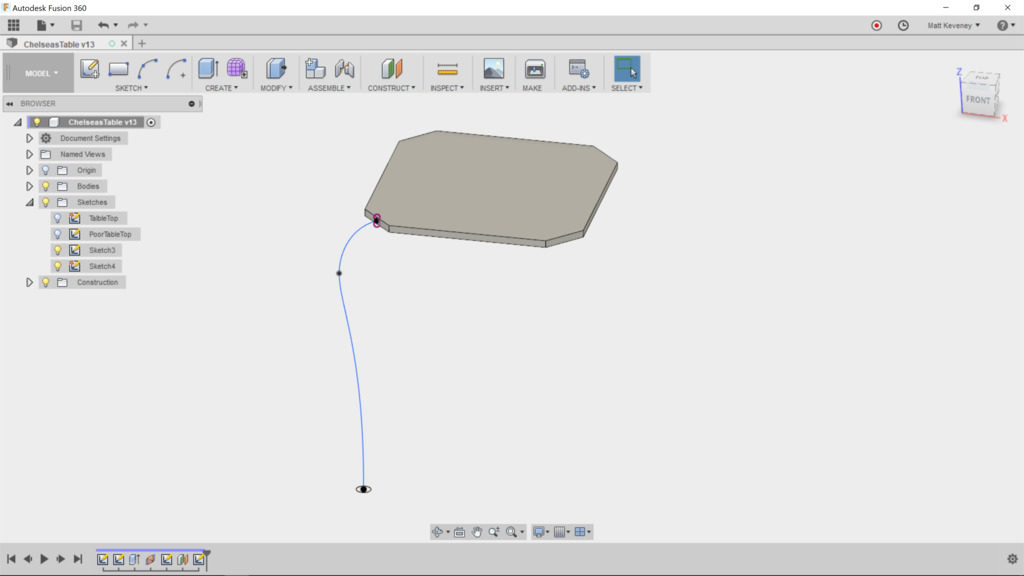
Now, we can create our loft. Choose the corner face of the table as the first profile; the foot sketch profile as the second. A weird-looking loft will be displayed since we haven’t yet applied the centerline.
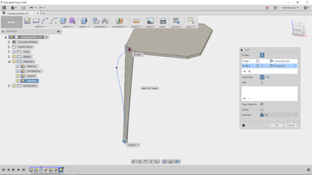
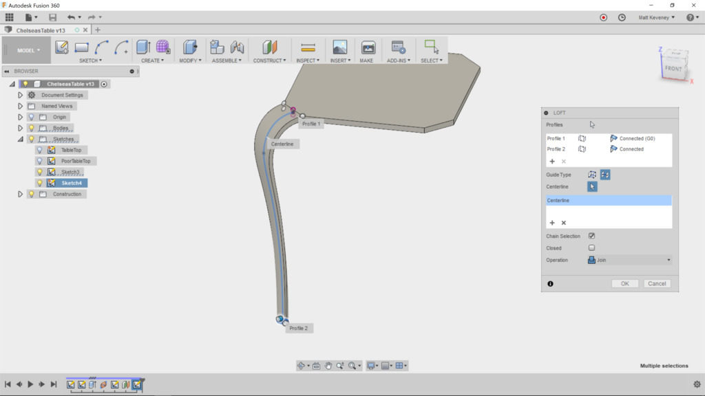
Choose the centerline guide type, and select the spline from the centerline sketch. The loft should now appear as intended.
Finally, we duplicate the leg for the other three corners. Since our table is square, we could simply use the circular pattern feature. Select ‘feature’ as the pattern type and choose the loft feature from the history list at the bottom of the screen. Select the vertical axis as the axis of revolution. I told you that would come in handy! Set the count to 4, and our basic design is complete.
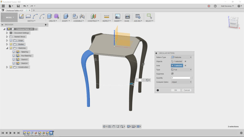
That’s fine, if we know we’re always going to want the table to be square. To make our design a more flexible, let’s use the ‘mirror’ feature instead. We’ll need to use it two times; one for each direction.

First, right click and delete the ‘circular pattern’ feature in the timeline.

Select the mirror tool; set the pattern type to ‘feature’ and choose the loft feature as before. Then choose ‘mirror plane’ and select the X/Z plane.
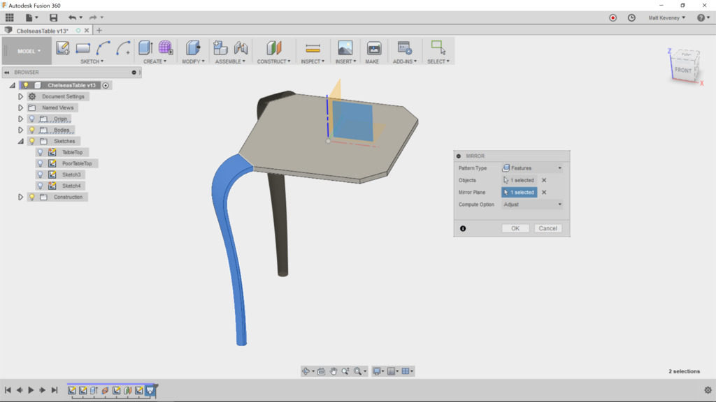
Now, create another mirror. Again, select feature type, but this time choose two features from the history list: the loft and the mirror we just created. Use the Y/Z plane as the mirror.
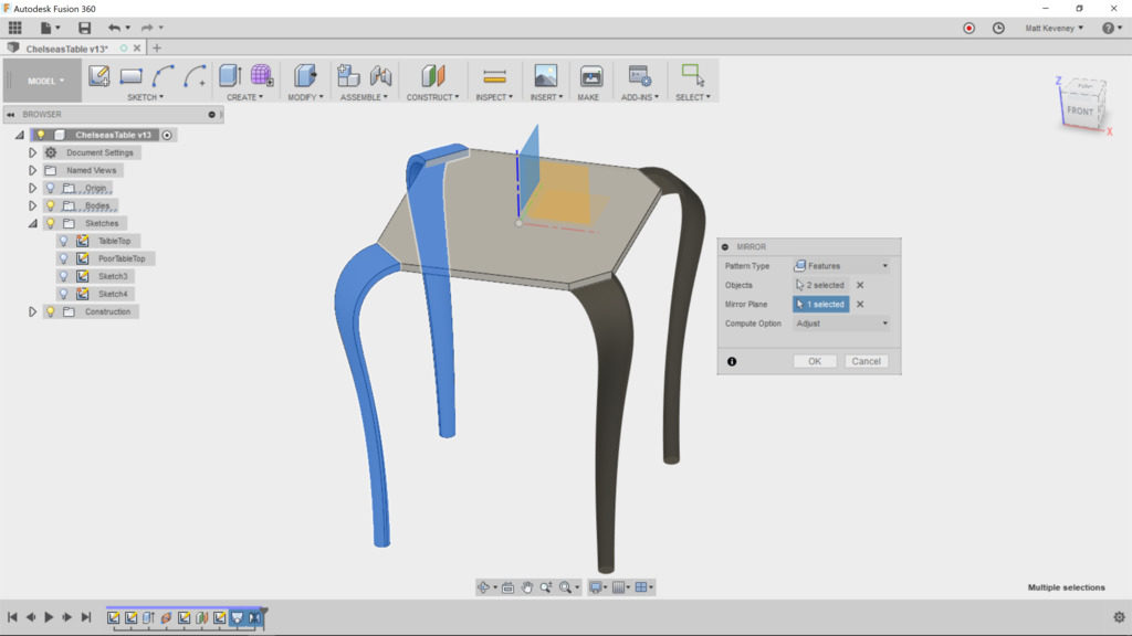
We get the same result, but we get the additional flexibility of making the table rectangular, which we’ll explore below.

First, let’s break those sharp edges. The fillet tool is what we want, but applying it to those complex lofted edges is computationally intensive and doesn’t always produce smooth results.
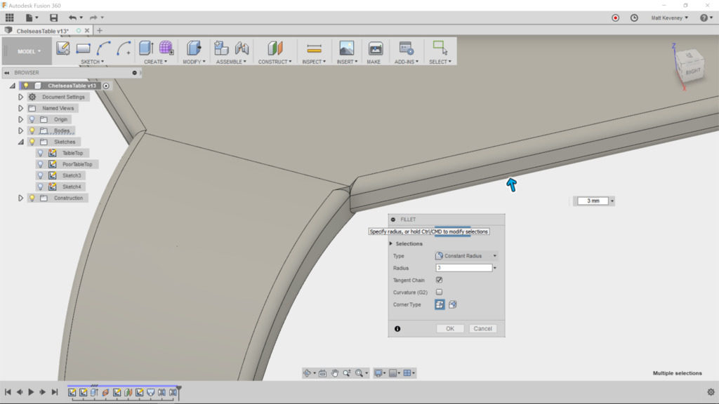
What we really wanted to do was to round over the tabletop edges before we lofted the legs. This way the loft would be created from a face that already has rounded corners. Fortunately, we can rewrite history with Fusion.

Drag the history marker to a point just past the extrude feature that created the tabletop. Now, select the fillet tool and round the edges that will end up exposed. do not round the edges at the corners, but do select both top and bottom edges, like so:
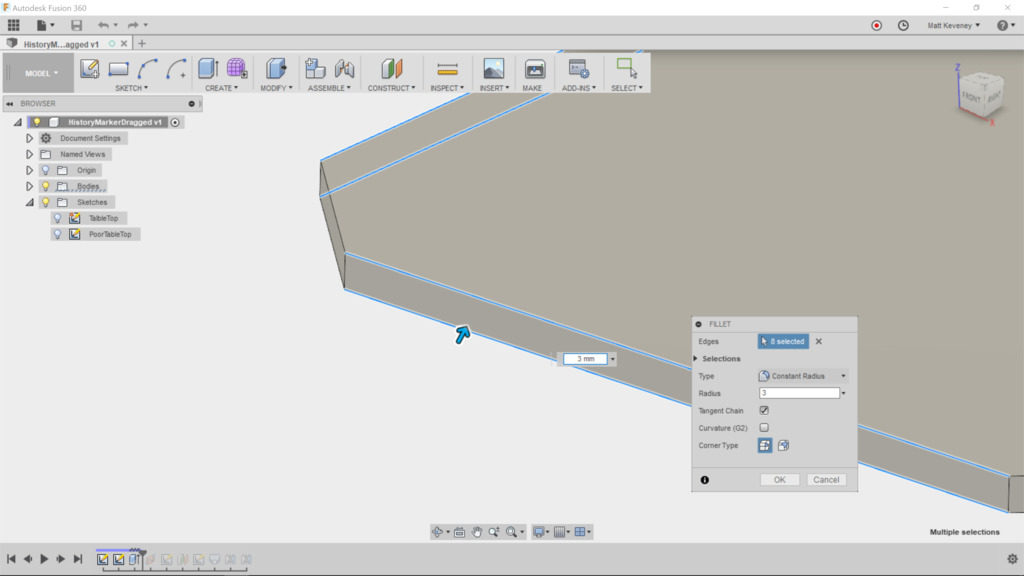
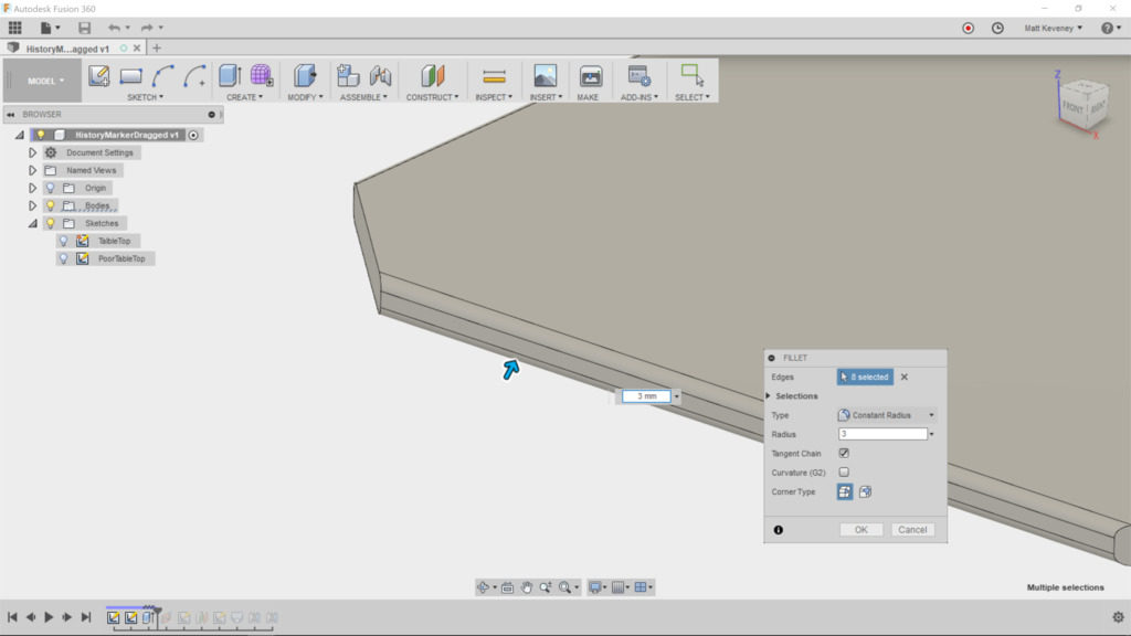
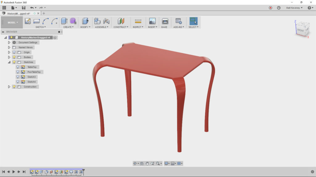
Now move the history marker back to the end. The legs now blend with the tabletop as intended. I’ve given it a glossy-plastic material.
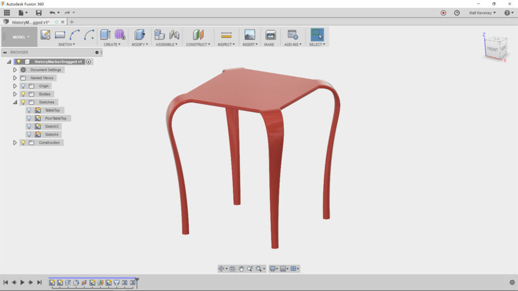
Let’s try out a few parametric features, to see if our extra work pays off. Change the table height by adjusting that parameter we created.

Changing the size of the feet gives the table a whole new character.
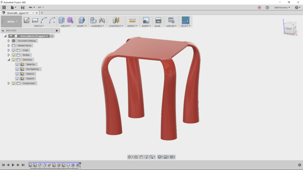
(If you expect frequent changes, it might be handy to create additional parameters for the table width, upper leg width and lower leg diameter. Then they could all be modified in a single place. I’ll let you play with that on your own.)

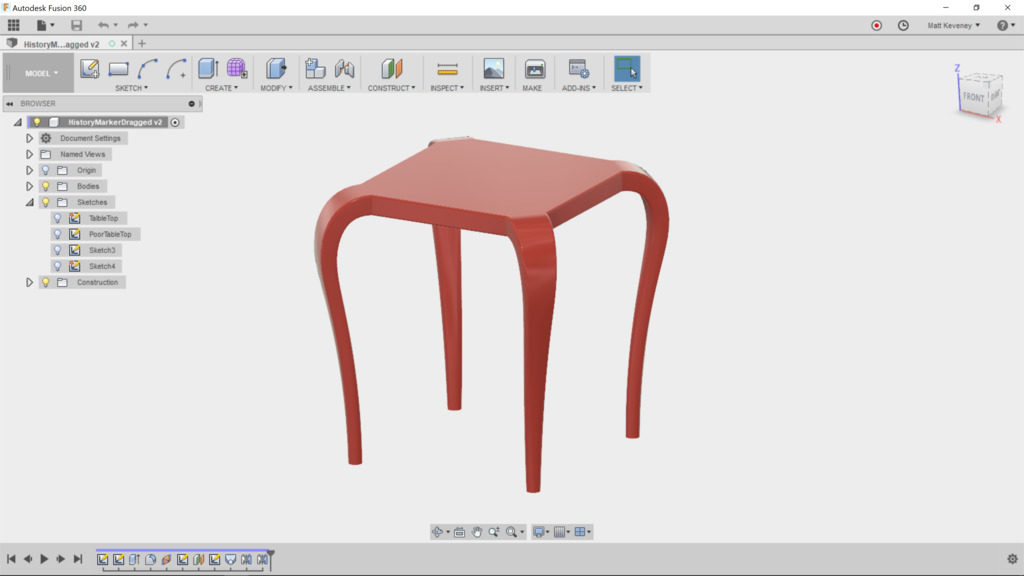
Change the thickness of the table by editing the first ‘extrude’ feature. It yields expected results, since we defined our table height referencing the table top, and attached the loft centerline to the midpoint of the table edge.
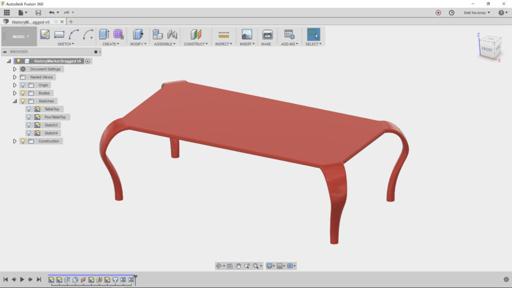
Finally, let’s make the tabletop rectangular. Edit the tabletop sketch and remove the ‘equal’ constraint currently applied to the lower and left sides. Now add a dimension defining the distance between the horizontal edges. Change the dimensions to 450 horizontal by 300 vertical.
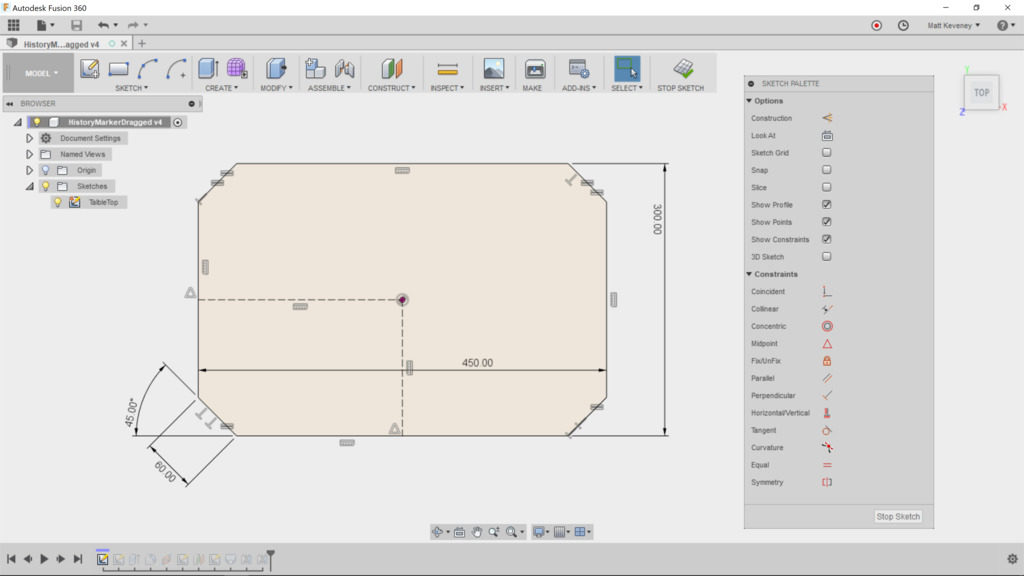
After saving we get this:
By changing just a few parameters, we can make a wider, lower, coffee table to complement our end-table.
Thanks for reading this long-winded article all the way down to here! To get the most out of Fusion, learn to use the parametric features, and use them wisely. Neglecting them or using them inappropriately can make your designs difficult to alter later, and believe me you will always want to alter your design later. The important thing is to consider maintainability as you go along.
A 3D printed Battleship!

Over Christmas I visited my family, and got to play a game of Battleship with my niece. It was just as much fun as I remembered when I was nine!

Unfortunately, they’d lost one of the destroyers, so we had to play with just four ships.

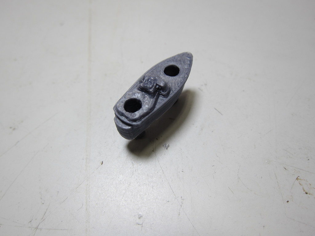
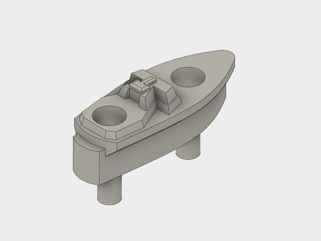
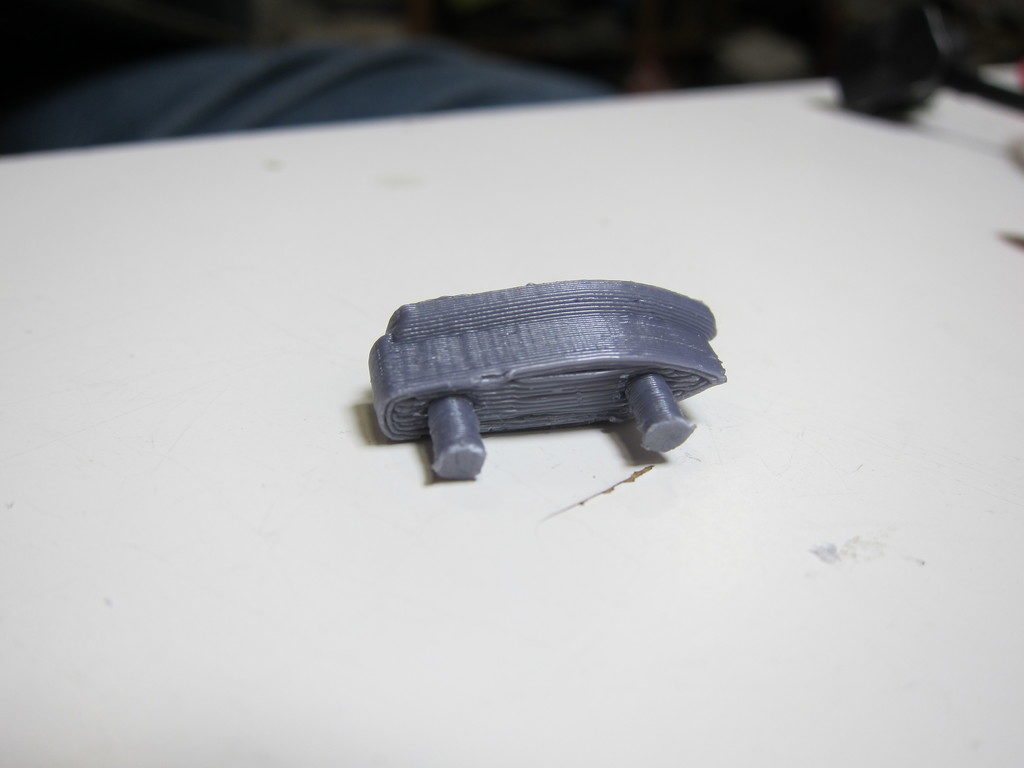
I offered to make a replacement with my 3D printer. I took measurements on the one that remained, and modeled it in Fusion 360.

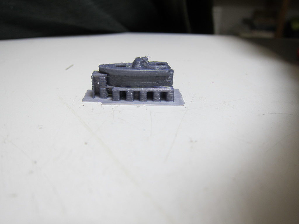
This blog post was supposed to be all about how to modify a model to avoid the use of auto-generated support material. I’d assumed that the support material would be too difficult to remove, would leave an unacceptable finish on the bottom, and that the pins would be too fragile and would break off with the rest of the support material.

Since this thing is so small, I decided to print it that way first, just to prove my point.

Unfortunately, I was able to clean it up in less than 5 minutes; the pins came out nice and strong; and the finish on the bottom is just fine. Sorry this article is so short and boring. Sometimes you just need to trust the technology and stop thinking so much!

Click here for the Fusion 360 Model file.

Happy Holidays everyone!


Fusion 360 Hangout at AMT

December 7th we started a new meet up for Fusion 360.

The group brainstormed on tool-path creation and resolved to develop an understanding of multi-stage CAM processes that can be used on the various mills, routers and cutters at AMT.

We had a terrific time at the hangout. Matt our 3D Printing steward and five others attended. All were quite experienced Fusion 360 users, in contrast to most of the previous Fusion meetings which tend to be weighted toward newcomers. I think everyone present was a AMT member.

We opted to pass the projector cord around and look at all of our projects as a group. Another approach might be to break off into twos or threes; maybe we’ll try it that way next time.

  • Bob showed us some renderings of cool guitar designs he’s been working on.
  • Rachel (aka Dr. Shiney) showed us a guitar body a client of hers needed cut; we struggled together for a while trying to figure out Fusion’s 3D tool-path generation. I think something like this would be a great thing to get Taylor’s input on: A multi-stage CAM process including facing, profiling, and 3D carving.
  • Emory gave us a quick look at his own CAM project, which involved re-mounting the workpiece to cut both sides: tricky stuff.
  • Chelsea showed us her silicone casting project. She’s come up with a pretty elaborate flask and core to be 3D printed. We’re all anxious to see the results, but those are going to be some long prints! I recommended smaller test pieces to get sizes and clearances right and generally experiment with the process before committing to the final design.
  • Matt brought along a bunch of finished projects you’ve probably seen before if you’re a regular at our Thursday meetings; nothing new, but all done in Fusion 360.


History editing in Fusion 360

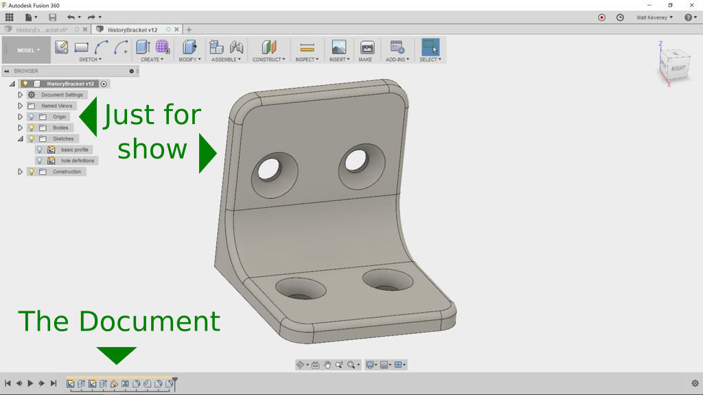
The 3D View is “Just for Show”

With most editing tools, the document you’re editing is comprised of the things displayed right in front of you. With a word processor, it’s the words; a spreadsheet, it’s the numbers and formulae; an image editor, it’s the pixels. This is also true of mesh-centric 3D modelers like Blender or SketchUp. When you move edges or faces, bore holes, or perform any other operation, you’re modifying the Mesh: a collection of points, edges and faces in Cartesian 3D space. The mesh itself is the document.

But with Fusion 360, the document is composed of the sequence of things in the history timeline (shown at the bottom of the screen). The 3D view in the center of the screen is the result of executing that sequence of operations. The things in the Browser (the hierarchical object list on the left), are also a product of the history timeline sequence. Think of the timeline as the program code that produces your design. As far as editing is concerned, the Browser and 3D view are just for show!

I’ve always thought that ‘history timeline’ was a misleading name. ‘Operation Sequence’ might be better. In real life we can’t yet travel back in time, so the term ‘history’ suggests that it’s merely an informational record of what already happened. Not so! Items in Fusion 360’s history timeline can be rearranged and edited. Learning how to do so is key to getting the most out of the tool.

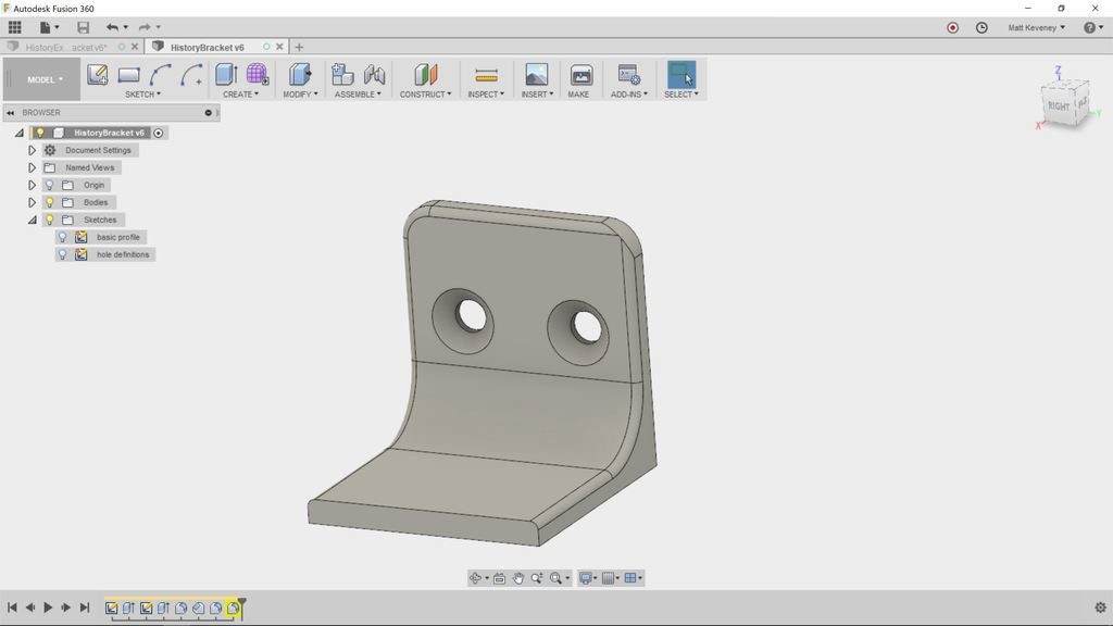
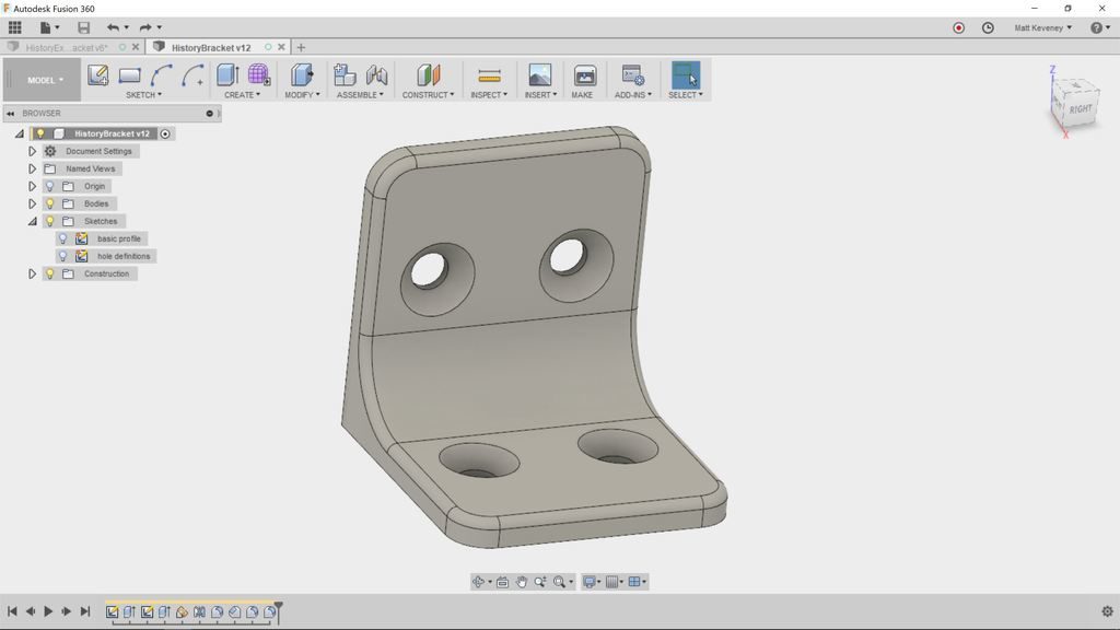
To get some practice with the timeline, let’s walk though a (somewhat contrived) example: The corner bracket pictured above.

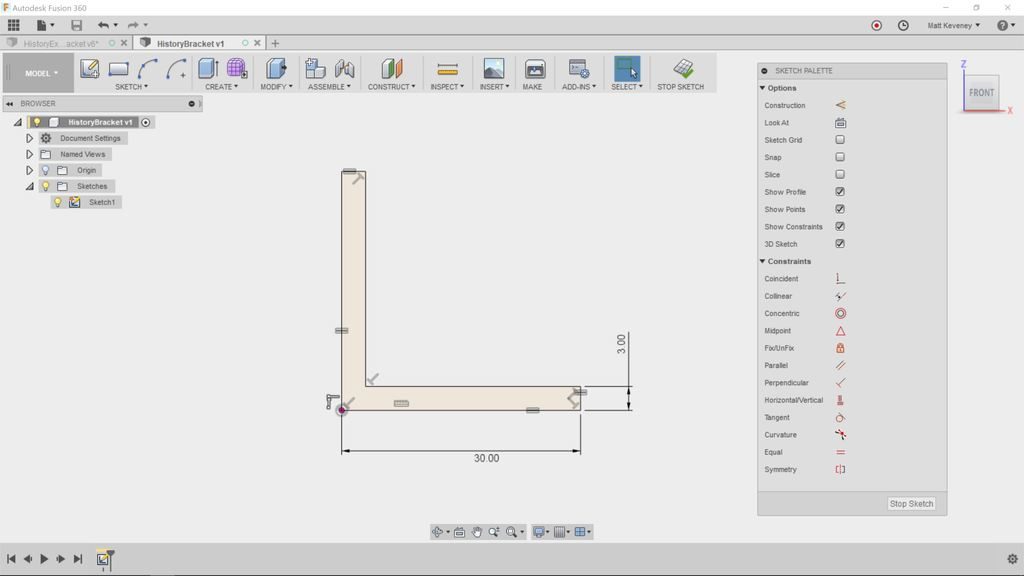
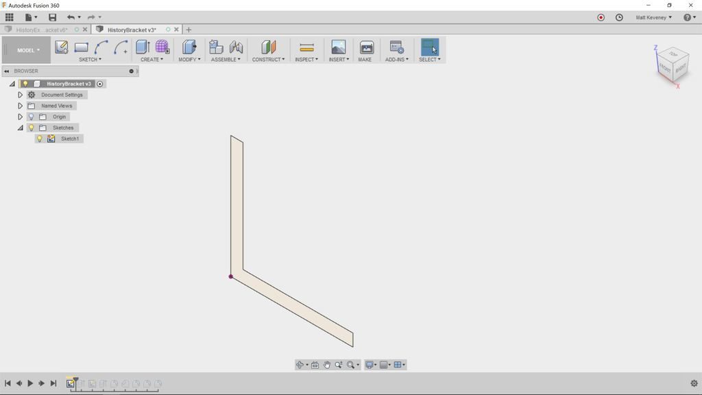
First create a sketch describing the basic cross section profile.

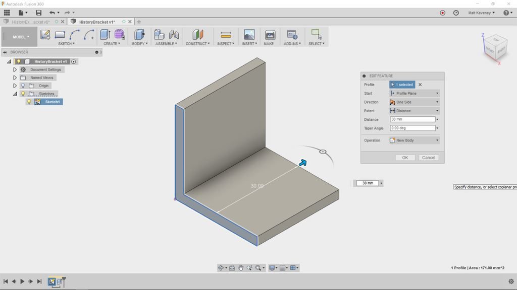
Then extrude with the push-pull tool to create a solid body.

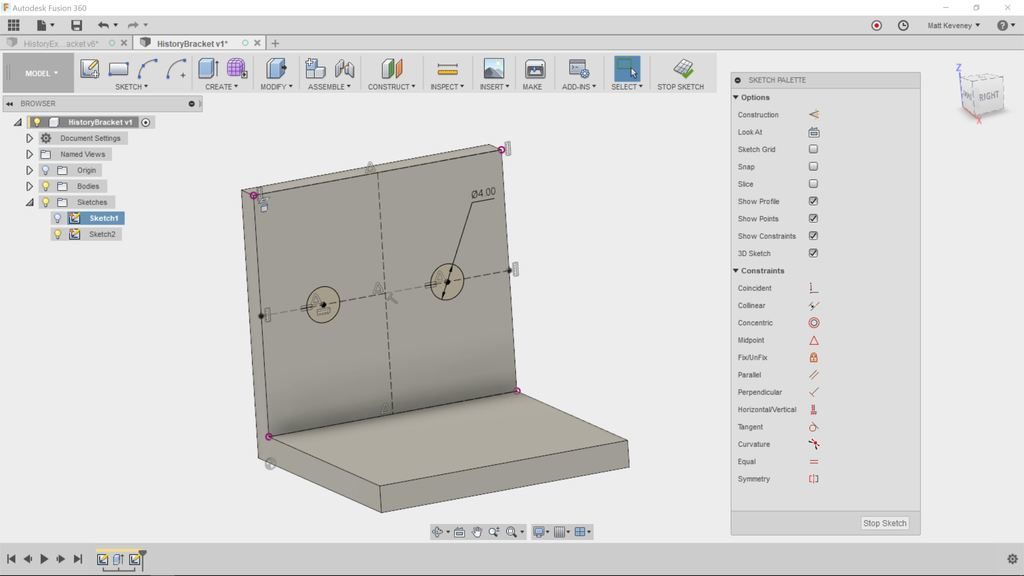
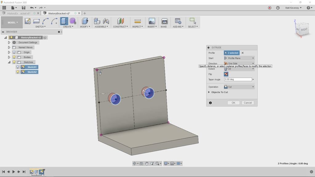
Now create a sketch on one of the sides to describe mounting hole profiles.

And extrude to bore the holes.

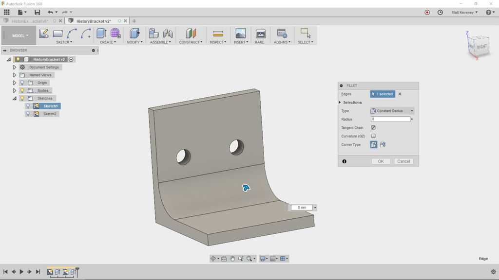
Now, we’ll use some of the modify tools. First, add a large fillet to strengthen the bracket.

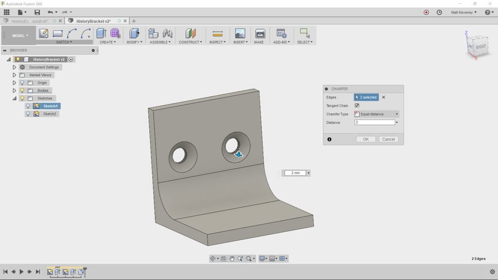
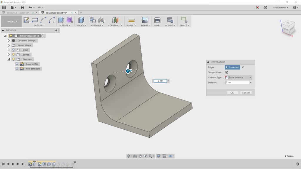
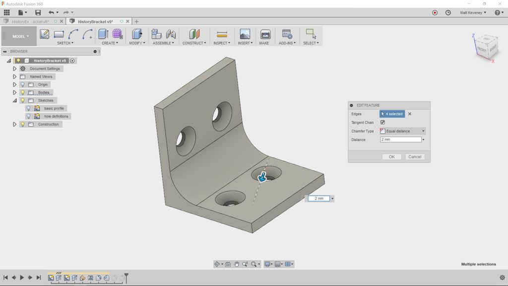
Add a chamfer to counter-sink the holes.

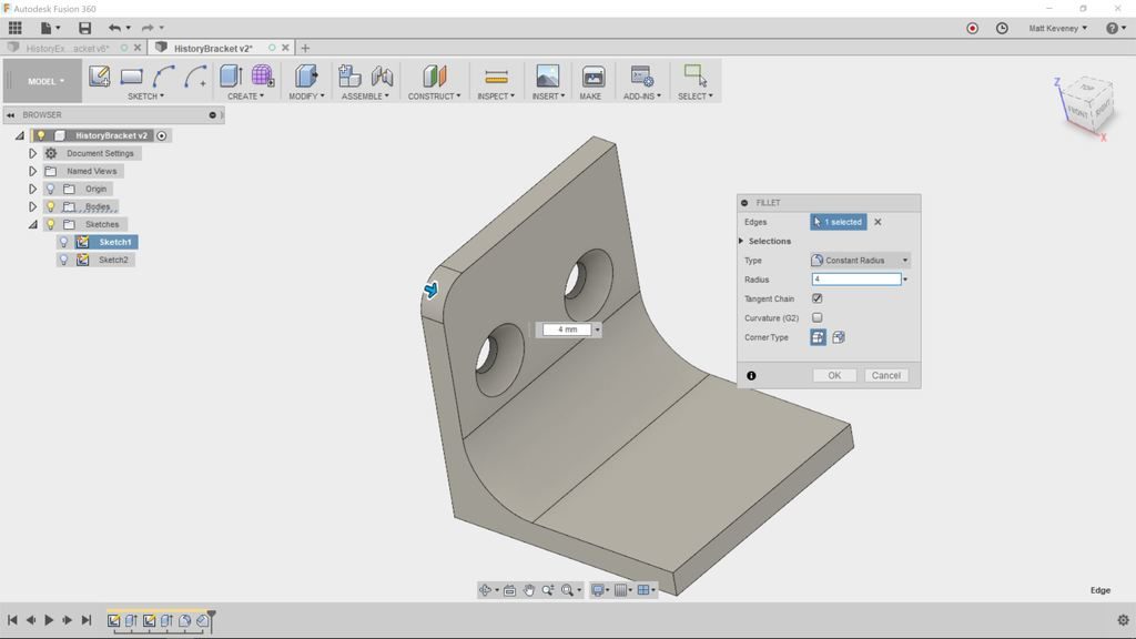
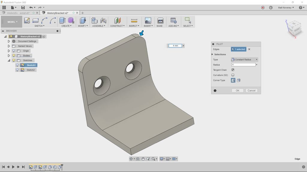
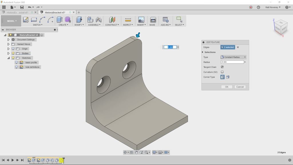
A fillet to round over the top corner.

Add another for the other top corner.

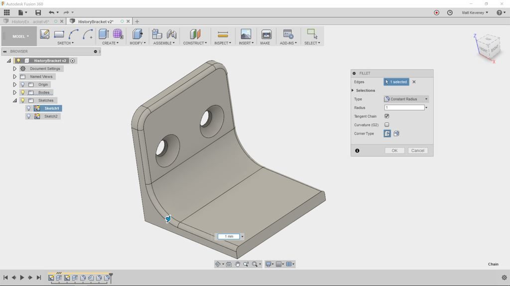
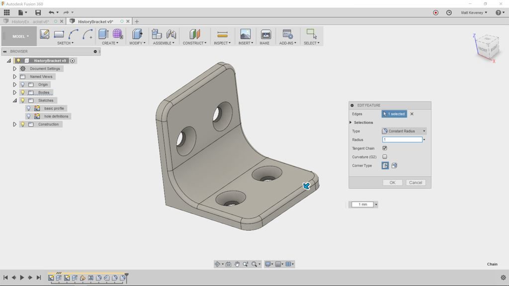
Add one more small fillet to break the sharp edges.

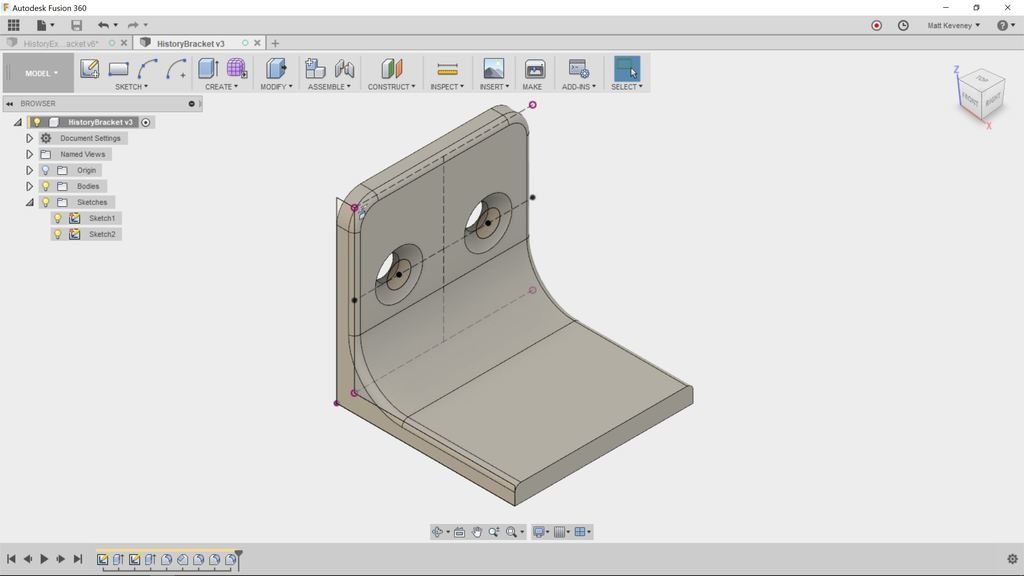
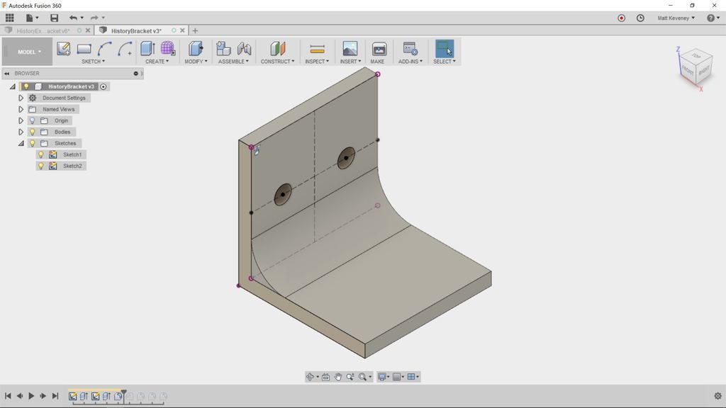
Well, it clearly needs some work, but let’s review the timeline to see what we’ve done so far. First, make the sketches visible for clarity’s sake (find the sketches in The browser and click the light bulbs). Then click the home and fit buttons to get this view:

Right click the first item in the history (a sketch) and select Roll history marker here. The body will vanish from the 3D view, and the Browser will display just one object; the sketch. Don’t panic; you haven’t deleted anything! Note that the items in the history are still there; they’re just grayed-out.

You’ve moved the history marker to display the model as it was defined at this point. Remember: the history timeline is your document; the 3D view and Browser are just for show.

Click the next step icon to advance the history marker. With each click, the display will update to reflect another operation. When you reach the end the 3D view will reflect the model as defined so far.

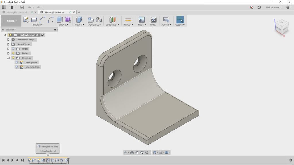
We can give the sketches and features more meaningful names. This is a good practice in any case, but is especially useful when getting familar with the history timeline.

Right click each item in the timeline; click rename and enter the following names:

basic profile
basic body
hole definitions
holes
strengthening fillet
countersinks
corner roundover
corner roundover 2
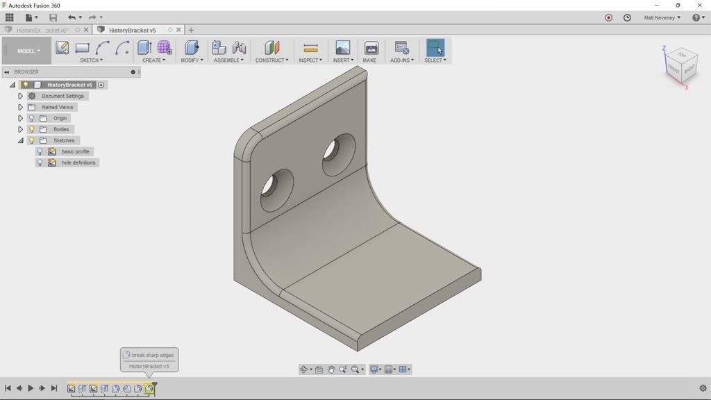
break sharp edges

To see the names you’ve just entered, hover the mouse over each item in the timeline. The names for sketches also appear in the Browser.

While labeling our history items (sketches and features), I remembered that we rounded the outer corners with two seperate features. It makes more sense to use a single feature, since both of these fillets should always be the same size. That way, if we ever want to change the size we need only edit one feature.

Right click the corner roundover 2 feature and delete it. Fusion will warn that the feature is referenced by other features in the timeline. Click Delete anyway!

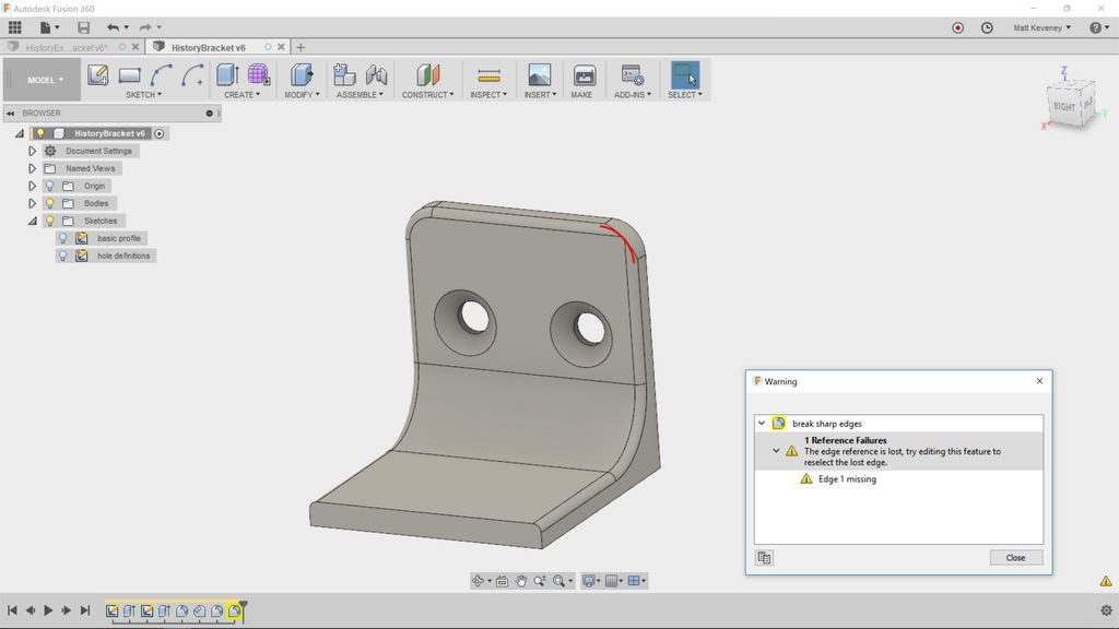
Now the break sharp edges round-over feature has a yellow background, indicating that something is amiss. Ignore this for now, we’ll come back to it.

Right click the corner roundover fillet and select edit feature (or just doubleclick the feature’s icon). The fillet dialog will be shown, and the 3D view/browser will reflect the model as it was defined at that point in the history.

The fillet dialog indicates that a single edge has been selected. Hold shift and select the other upper edge. Then release shift and click OK.

Notice that the break sharp edges round-over hasn’t been applied to this new fillet. This is due to the same issue that arose when we deleted the corner roundover 2 feature.

So, let’s have a look. First, right click and choose review warning. This displays more detail about what went wrong. In this case it says: “The edge reference is lost, try editing this feature to reselect the lost edge.”

So, let’s try editing as suggested. Double-click the feature to edit.

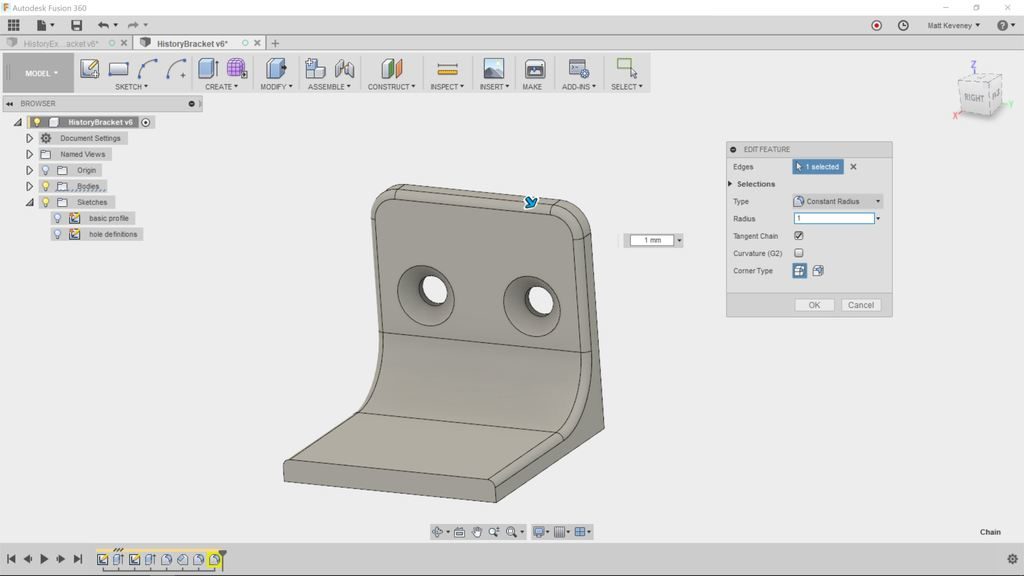
Even though the model has the same shape as before, the underlying edges that define the body have changed due to our upstream edit. Notice that it now says two edges were selected (originally there was just one chain of edges). If you press shift these edges will be highlighted. You can clearly see a gap where the redefined fillet is.

Click the ‘X’ next to edges in the dialog box to deselect the edges; then reselect the edge. It will select the entire edge chain again. Once saved, the yellow warning background will disappear.  Be sure to address all warning issues in your timeline! If ignored, they’ll just cause trouble later.

When editing something in the history, we often have to review and adjust downstream features like this. This can be very frustrating if you aren’t familiar with the timeline. With a little practice it becomes second nature, and is a worthwhile skill to attain sooner rather than later.

So, let’s finish our bracket. We need holes and round-overs on the other tab, and our break edges fillet needs to go around the entire perimeter.

We’d like the hole pattern to be identical on both tabs of the bracket. We could duplicate the sketch and extrude operations that we used on the first tab, but if we ever changed the pattern (maybe to use more holes), we’d have to edit two sketches instead of one, and we’d have to be careful to keep them identical. By using a mirror operation instead, we can use a single hole definition, making for simpler adjustments later.

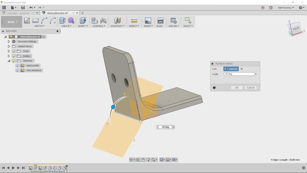
First we need a reflecting plane. Choose Construct/Plane at angle and select the bottom edge at the apex of the bracket. Enter an angle of -45. Then right-click the feature in the timeline and rename it reflecting plane.

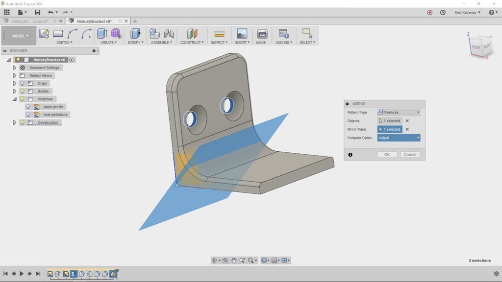
Now, click Create/Mirror. Set the pattern type to Features, then select our holes extrude feature (in the timeline) and click OK.

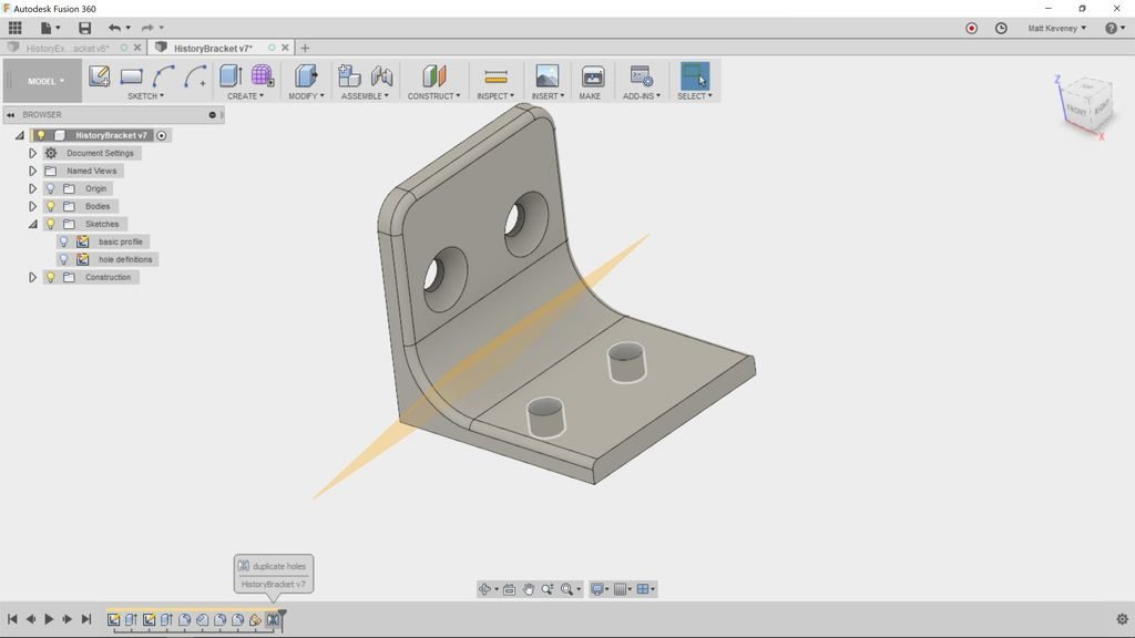
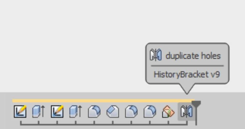
Right click the mirror feature and rename it duplicate holes.

Turn the construction plane display off now, just for clarity.

We’d like to countersink these new holes too, but if you double-click to edit the countersinks feature, the new holes do not appear for selection!

That’s because the new holes did not exist at the time we created the countersink object. Note that the countersink feature appears before the mirror feature in the timeline. You might be tempted to simply add another countersink feature, but there’s a better way!

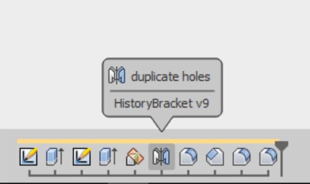
To fix, let’s move the reflecting plane and mirror objects to an earlier point in the timeline. Press shift and select both features. Then drag the features to the left. You’ll find you can’t go further left than our holes feature. Release the mouse button to complete the move.

This illustrates an important concept: Any feature that references another must appear after the dependent feature in the timeline. In this case, the duplicate holes mirror feature refers to the holes extrusion feature, so duplicate holes must appear later. This also applies to sketches that contain projected geometry: The edges being projected must be defined before the sketch.

Now double-click the countersinks chamfer feature to edit it. Since it now happens after the mirror feature, we can add the new holes to the set of ‘edges’ this feature affects. Shift-select the additional holes and click OK.

Let’s fix the corner round-over the same way. Double-click to edit, then shift-select to add the other two edges.

Finally let’s fix the break sharp edges feature again. Double-click to edit it. Click the ‘X’ next to the edges button do deselect all. Then reselect the edge. This time it should select the entire perimeter as originally intended.

Notice that we did all that cleanup without adding much to our history timeline. We removed one feature, then added two and adjusted a few.

The more natural thing might have been to add a new sketch and another extrusion for the extra holes; then apply the fillet and chamfer tools again. Resist this temptation! The model might look the same, but the document will be larger than necessary, will be more difficult to edit later, and will slow Fusion down.

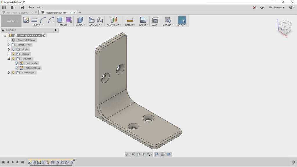
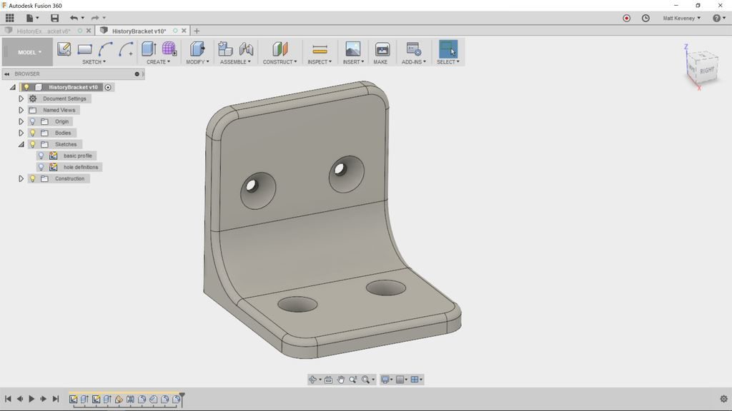
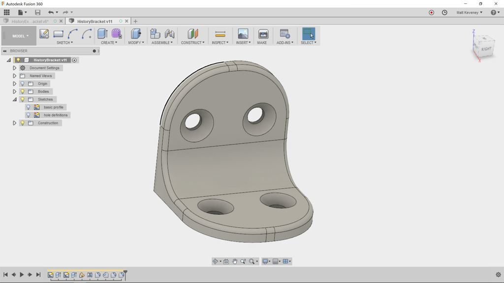
With our concise model, edits are a breeze. Here’s the original plus 3 variants. Each variant was made by editing a single value in a single sketch or feature.


Remember: The history timeline is your document. The rest is just for show!


P.S. The document comparison I made here is oversimplified. Some bitmap editors like Microsoft Paint modify pixels directly, but Photoshop and Gimp documents contain layers and other high-level objects. A Blender document is actually a mixture of a mesh and high-level ‘modifier’ objects, among many other things. In Fusion 360, the ‘sculpt’ workspace offers freeform mesh-based editing much like Blender. Also, Fusion does store faces and bodies in the document that don’t appear as distinct items in the history. I simplified in order to illustrate my paradigm. I lied only to more clearly illuminate the truth.

CNC Monitoring

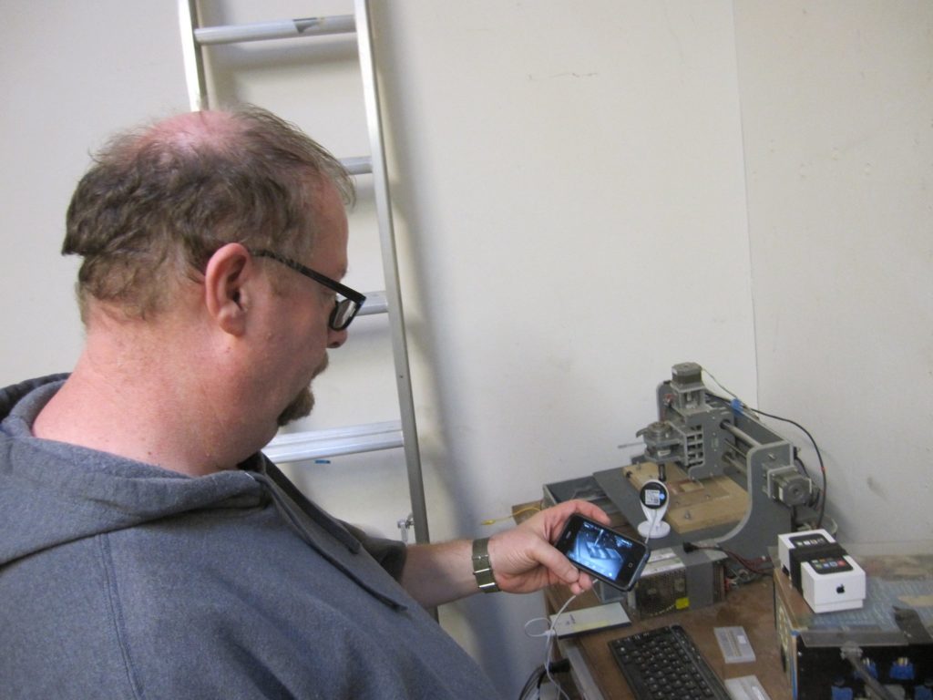
At AMT you are supposed to stand over your CNC machine as it is doing a job and pay attention.  Is it hanging up?  Is it breaking itself or the bit?  It is on fire?  These are all important things to know. However sometimes a job takes…forever.  When cutting PCBs the job can take over an hour because I have the bit move so very, very slowly. Faster and the bit shatters into tiny little pieces of carbide all over the room.  Not good.  I’ve noticed for awhile that inexpensive internet webcams are available, think of it as a BabyCam for non baby owners. Turns out this little $30 wonder does a great job. When setting up the PCB to be cut I can put the camera on it, configure it to talk to my phone over the AMT network and I can be upstairs working on say a soldering job of the last PCB while the next one is being made. Very handy.

I would recommend everyone who has long CNC jobs they need to keep an eye on but don’t always want to stand over the device to try out something like this.

Type A Rehab – 3D Printing News

A note from our 3D Printing Steward:

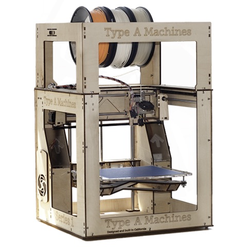
I have great news.  The Type A-printer upgrade is complete!

It now sports automatic-bed-leveling just like the Prusa.  Just slice, transfer the gcode the SD card, and print.  No fiddling with leveling screws. I’ve done some testing and am confident it’s ready to go.  Please let me know if you discover otherwise.

I’ve updated the Type-A wiki page and 3D printing 101 docs.  Unfortunately I hit a snag trying to update the files on our wiki. Until we sort this out, please use the 101 doc and printer profile uploaded below. (This new profile is already installed on the 3D print computer; you only need it if you slice from your own laptop.)

You will need to read the updated 101 PDF; the filament-change interface is amazingly stupid.

This was a team effort.  Huge thanks to Mark Wells and Austin Young.  They answered the call a couple weeks back to help out.  Austin made the new aluminum bed, while Mark figured out the wiring for the inductive probe.  I updated the firmware, and learned a great deal in the process.  It was more confusing than I’d expected.

Thanks for your patience during the down-time.  I think you’ll find this is a huge step in usability, and well worth the wait.

For more on 3D printing, join the #3dprinting channel or contact @mkeveney on Slack.

The Vorpal Combat Hexapod

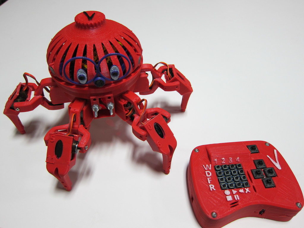
I demonstrated this fun robot at the last BoxBots build night and our general meeting last Thursday. Since then a few folks have asked questions so I thought I would post more detail.

The Vorpal Combat Hexapod is the subject of a Kickstarter campaign I discovered a few weeks ago. I was impressed and decided to back the project. I had a few questions so I contacted the designer, Steve Pendergrast. Then I had a few suggestions and before long we had a rich correspondence. I spent quite a bit more time than I’d expected to, offering thoughts for his wiki, design suggestions, etc.

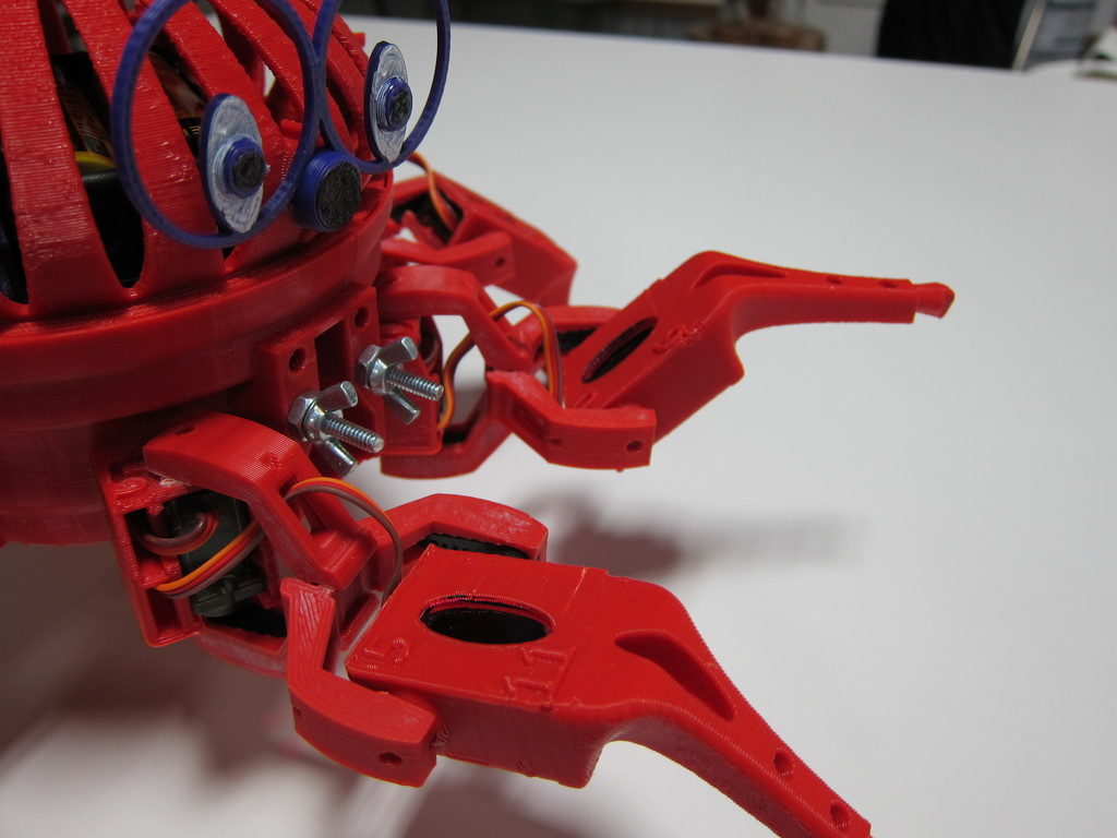
Steve appreciated my feedback and offered to send me a completed robot if I would promise to demonstrate it for our membership. The robot you see in the photos was made by Steve, not me. Mine will be forthcoming!

You can read the official description on the Kickstarter page and project wiki. Here are my own thoughts and a few of the reasons I like the project so much.

It’s cool!

It has to be to get the kids interested; something that Ray has always understood with BoxBots. While BoxBots offers the thrill of destructive combat, the hexapod offers spidery, insect-ish, crawly coolness with interactive games and programming challenges.

It’s a fun toy

Straight away, this robot offers lot of play value. There are four walk modes, four dance modes, four fight modes, and a built-in record/playback function. To get them interested in the advanced possibilities, you have to get them hooked first. Don’t be intimidated by that array of buttons. At the Boxbots build night, the kids all picked it up very quickly. I couldn’t get the controller out of their hands.

It’s open-source

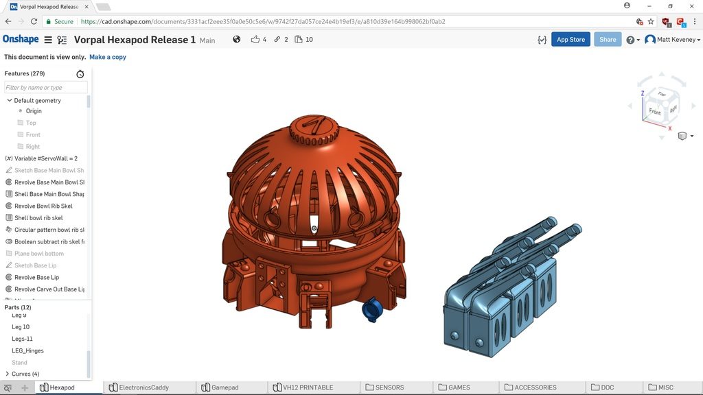
The circuitry, firmware, and plastic parts are already published. A lot of crowd-funded projects promise release only after funding, and some only publish the STL files, which can be very difficult to edit. Steve has provided the full CAD source (designed in OnShape).

Easy to Accessorize

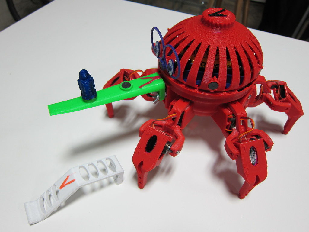
The Joust and Capture-the-flag games use special accessories that fasten to a standard mount on the robot’s nose. This simplifies add-on design since there’s no need to modify the robot frame. There are also magnets around the perimeter, encouraging fun cosmetic add-ons like eyes and nametags.

Off-the-shelf electronic components

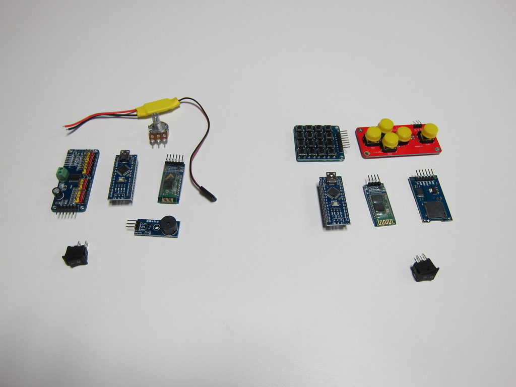
There are no custom circuit boards here. It’s built with two Arduino Nano boards, two Bluetooth boards, a servo controller, buzzer, pot, micro-SD adapter, two pushbutton boards, inexpensive servos, etc. This stuff is all available online if you want to source your own parts. If you’re an Arduino geek, it will all look familiar.

No Soldering!

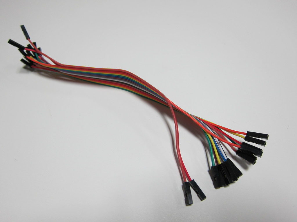
I think every kid should learn how to use a soldering iron in school, but for some it remains an intimidating barrier. In the hexapod, everything’s connected with push-on jumper wires. (If you source your own parts you will probably have to solder the battery case and switches, since these seldom have matching connectors.)

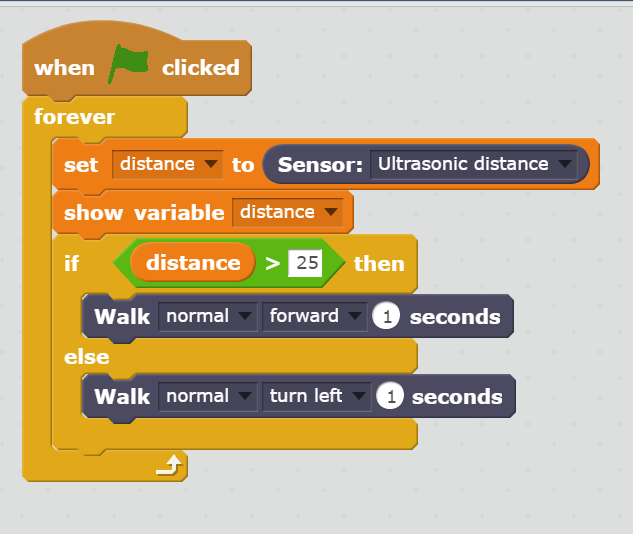
Scratch programming interface

The controller and robot firmware is written in Arduino’s C-like language, but the robot also supports a beginner-friendly drag-and-drop programming interface built with MIT’s Scratch system. I confess, I haven’t investigated this feature yet, but I’ve been curious about drag-and-drop programming paradigms for years. My first programs were stored on punched cards. Finally, I have an opportunity to see how today’s cool kids learn programming!

It’s 3D printed

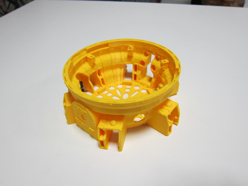
The parts print without support, and work fine at low-resolution. You’ll want to get your own spool of filament so you have the color available for replacement parts. Any of our printers will work. I’ve had good luck so far with PLA, but Steve recommends more flexible materials like PETG or ABS.

Anyway, enough gushing. I do not have any financial interest in the project. I just like to encourage a good idea when I see one. The Kickstarter campaign just reached its goal a few days ago, so it’s definitely going to be funded. If you’d like to back the Kickstarter or learn more, here’s the link. You’ll have to act fast; there are only a few days left. (Full disclosure: I do get referral perks if you use this link.) Remember that you always assume some risk with crowd-funding. I’ll make no guarantees, but I’m satisfied that Steve is serious about the project and is no scammer.
Click here for the Hexapod Kickstarter campaign.

If you’d like to see this robot in person, contact me on Slack. I’ll try to arrange a demo.

-Matt

3D Print Hangout, September 18, 2017

Wow, I’ve really slacked off on my hangout reports. This week we had three guests: Chelsea, Mack, and one other fellow who’s name I neglected to write down.

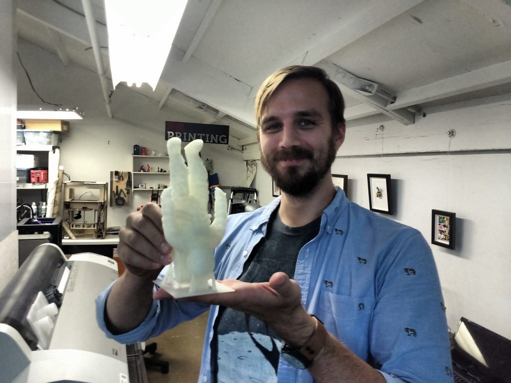
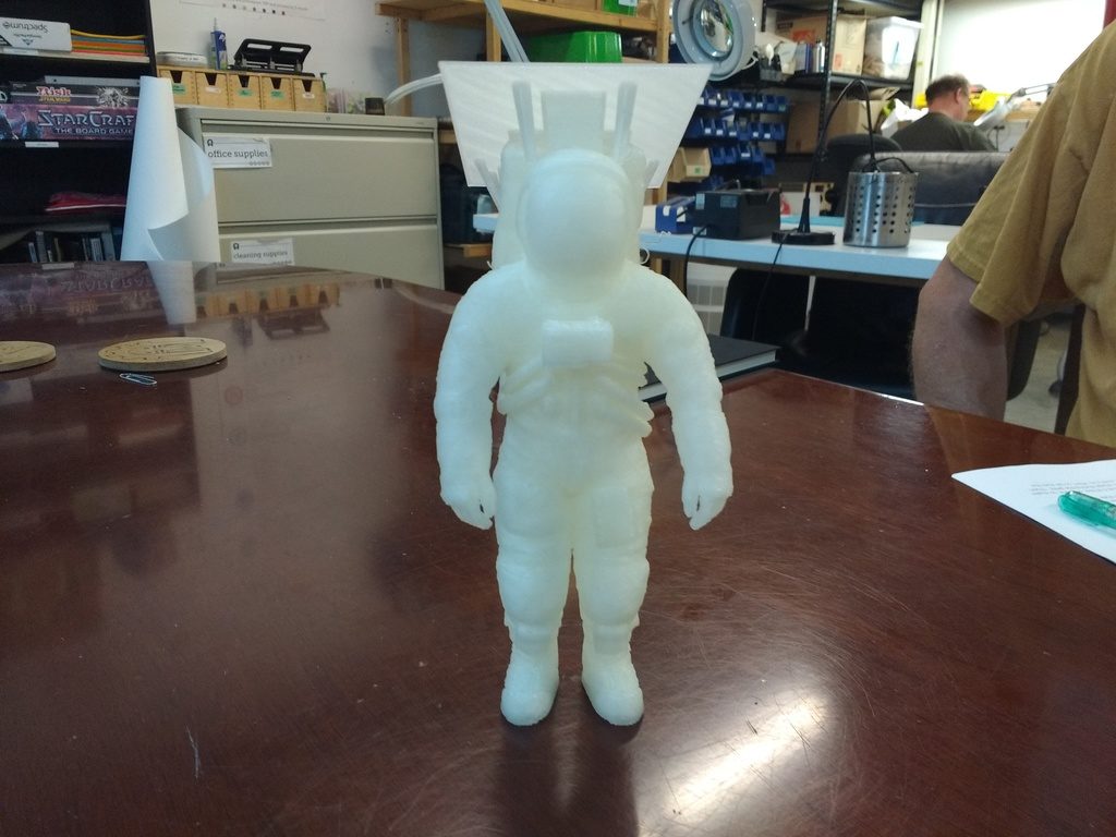
As we convened one of our 3D printing veterans, Brian, was just finishing up an incredibly cool model of Buzz Aldrin! This may be the biggest thing yet printed on our Prusa… over 6 hours at low-resolution! Inspirational to say the least. The designer (Brian’s friend) added a custom support structure platform that held Buzz upside-down while printing; the photos show it still attached.

I’m still getting used to our new home, a cozy little corner upstairs in the northeast corner of the co-working space. I’ve found it easiest to conduct the classroom portion of the training at one of the big meeting tables. For the live-demo segment, we all squish back into the corner, or sometimes I bring a printer out to the big table. I haven’t figured it all out yet, so please have patience while I adjust!
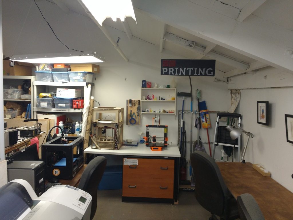
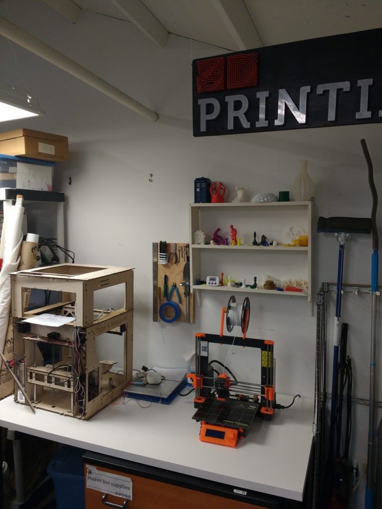
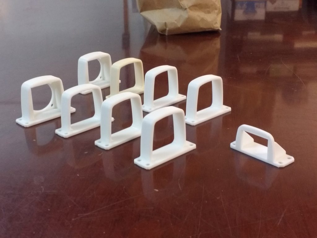
This week I demonstrated by printing a few parts Rachel commissioned for her electronic blinky stilt walker costumes. She needed a few small brackets to hold a fan and a power switch. These get sewn into the costume via the little mounting holes; you’ll have to ask her the rest of the details.

Chelsea has a few ideas for molding things in Silicone, but wasn’t sure how flexible the material would end up. So, we designed and printed a test mold of a small ‘staircase’ that exercises different thicknesses. We’ll have to encourage her to post the results!

Mack is a teacher, and had some cool devices his students use for momentum experiments. Parts like this can be difficult to model for 3D printing. Any support material would likely ruin the finish; but the curved shape can’t be printed without it.

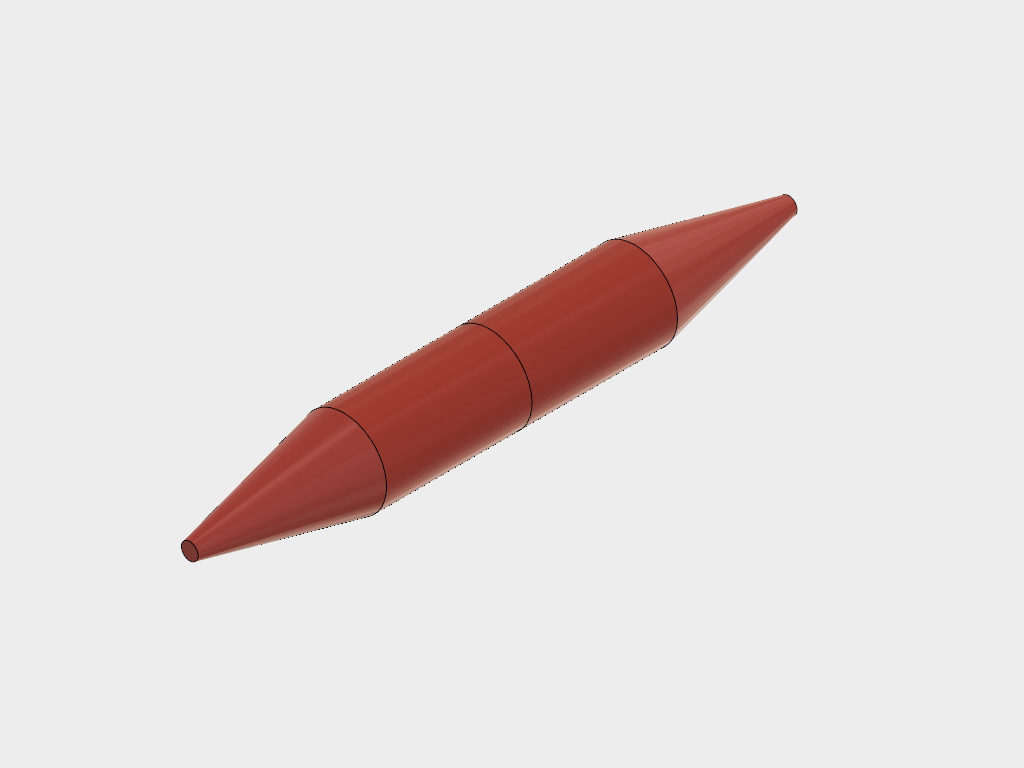
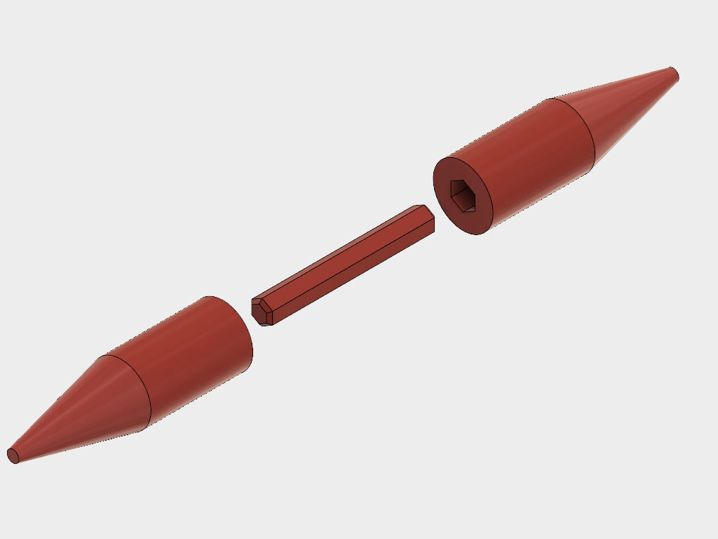
We solved the problem by designing the spindle in three parts. The conical parts will be printed vertically, while the joining pin gets printed horizontally for strength. We didn’t get a chance to print this one; by then it was getting late out. This image shows the spindle only; the complete project includes a weighted disk in the middle, rather like a toy top with two points.

So that’s it for this time. Remember, we’re still doing the 3D printing hangout regularly, every other Monday. Check the calendar for exact dates, and come on by. You don’t have to be a member to attend. Experienced 3D print folks are especially encouraged to bring their cool items by for show-and-tell. We’d love to see what you can do!


Quadcopter assembled

The Pig Hawk Quadcopter

Quadcopters are really fun, and I wanted to build one for a long time. My main intent was to take pictures and shoot videos from a new angle. Also, this has to be fun to fly!


Team work

Quadcopter teamwork

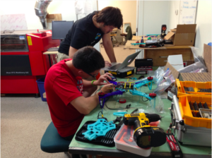
I was working on this project with a few friends, all of us were absolute beginners when it comes to quadcopters. Since the construction can be split into subtasks it was easy to keep everyone busy, between soldering cables, tweaking the 3D printing settings, or configuring the flight controller. Team work is fun, especially when you spend several hours focused on the same project. Everybody learned something along the way.


Leveraging 3D printing

Quadcopter pieces

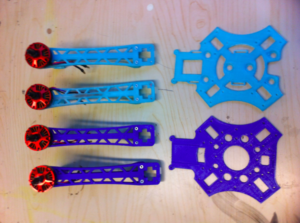
Because we wanted to learn about how quadcopters work, we choose to build our own instead of buying one ready to fly. It’s easy to find some sample designs on Thingiverse, for example. We choose to start with the crossfire 2 and customize it a bit to better fit our parts, usage, and to cope with our really poor pilots skills (because crashing means re-printing parts.. And we crash A LOT! :)).


Working on the assembly

Quadcopter assembled

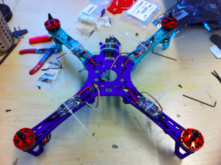
The crossfire 2 comes with a very detailed instruction guide. For most parts you just need to follow the guides, and some parts are specific to the components you choose. We picked the PixHawk flight controller for example (of which the project’s codename is a pun). Overall it was rather easy to get everything assembled. Here you can see the quadcopter with half of the body assembled, the four arms, and the ESCs (Electronic Speed Controllers).


Sample shot

Quadcopter aerial picture

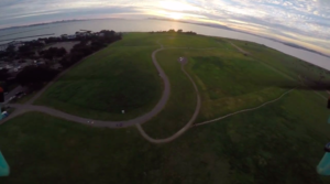
After several weeks of hard work, long hours reading documentation and tweaking the settings, it was time for the inaugural flight. Of course, we crashed it a few times in the process of learning how to fly the thing correctly. But the feeling we got when we were able to make it do almost what we wanted was worth the effort. We hooked up a GoPro on it, and went flying at Cesar Chavez park for a sunset. The view was gorgeous.